Advanced fonts include OpenType features which allow you to design advanced typography and achieve design nuances with ligatures, alternate characters, special numerical characters, precise placement for niqqud and more. It’s time for me to set these things straight for all of us: What can you do with those features and how on earth do you use them?
OpenType Features you Should Know
There are over 140 features, but just a dozen of them are relevant to most designers. Here I will write about the most important features and how you can start using them in your designs. Let’s begin!
Common/Standard Ligatures
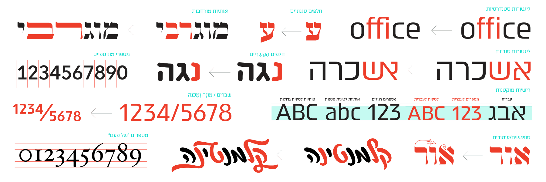
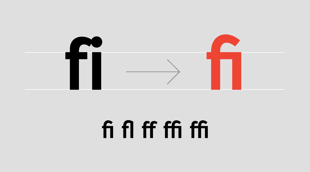
These ligatures are used for the correction of unpleasant letter combinations, such as fi, fl, etc. This feature is usually automated, and if it isn’t – turn that option on, you might find random surprises.
Discretionary Ligatures
These ligatures are not default and must be activated in order to display. These are usually more “decorative” or experimental ligatures. These may include: ct, st, etc. This is where the real fun happens.
All Caps / Small Caps
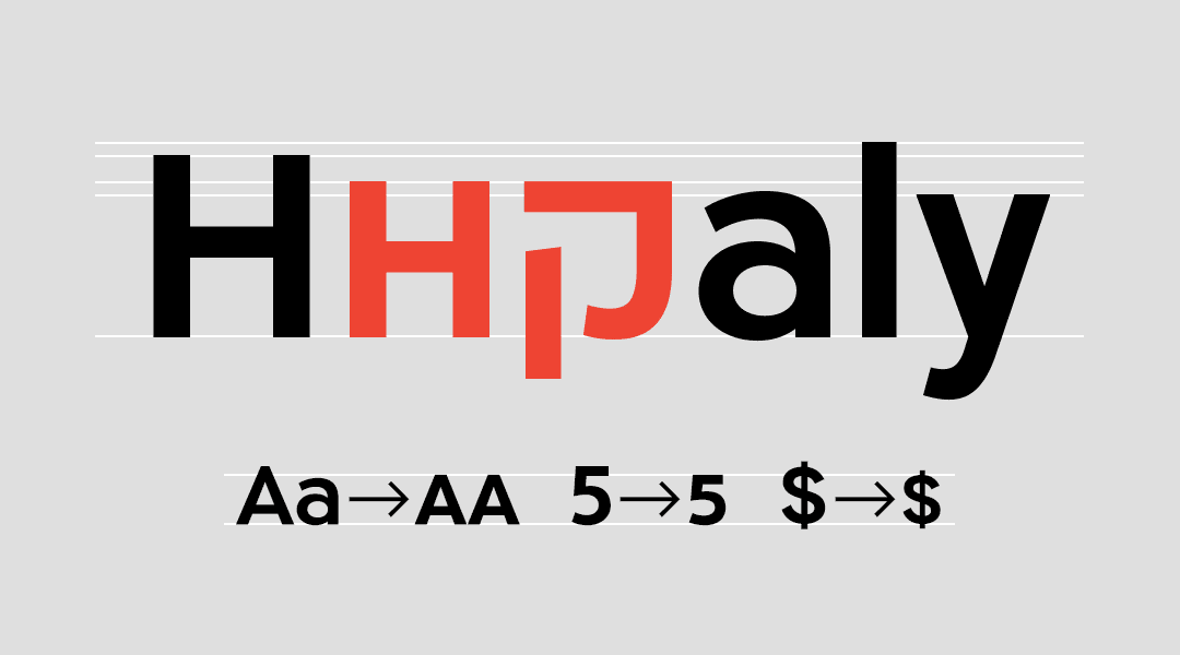
These are uppercase Latin characters that were adjusted for a lower height – Shoulder Height – and in our local context, this would usually be the height of the Hebrew letter. Very useful in bilingual fonts.
Stylistic Sets / Stylistic Alternates
These are for the letters’ alternative characters. The typographer has decided to give you more than one character for certain letters: small A’s, a straightened Ayin, a bent Lamed – sky’s the limit.
Contextual Alternates
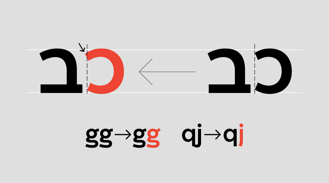
This lovely feature replaces characters based on adjacent letters. It’s very useful in solving the problem of two letters that just don’t look right next to one another, and kerning can’t solve the issue. Notice the example above, where the base of the letter Nun became shorter in order to get closer to the letter Gimel.
Swashes
Swashes is a fun feature to say out loud (try saying it a few times fast!), and it’s even more fun to use. Turn it on and you’ll get different decorations and swirls on some of your letters. Woohoo! This feature is usually available in calligraphic fonts or in classic Latin fonts (Garamond, Granjon, etc). Use them wisely.
Fractions
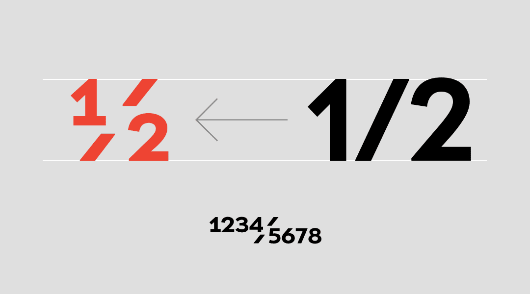
A set of fractions like ½, ¾, ¼, etc. Must-have feature if you’re writing a recipe book. And if you think that’s cool, wait til you see the next feature.
Numerators, Denominators
Endless fractions with which you can write 120/1294, for example, in a neat fraction form. We’re not really sure on how useful this is, but it’s really cool.
Tabular Figures
These numbers are usually identical to regular numbers, with one difference: their container width is identical. It’s called tabular because it was made for table use. So if you’re designing a price table, this feature would be very useful.
Oldstyle figures
Special numbers (sometimes called Hanging Figures or OsF Figures) designed with ascenders and descenders. These numbers have a traditional set of rules regarding which numbers ascend or descend. They’re usually used in Latin body text because their cadence is similar to that of lowercase letters, making them more readable in smaller text sizes. In addition, if they’re well-designed, why not use them for certain titles or invitation dates, for example.
Local
Letters, numbers or certain characters that will only be displayed when using a specific language in graphic programs. For example, Arabic numbers or Bulgarian versions of Cyrillic characters. Every so often, you will encounter fonts in which this feature is used for numbers that have been adjusted to the x-height of Hebrew letters, but in many cases it is the All Caps feature that does the trick.
And there are other features that aren’t as common or useful in Hebrew, but still worth mentioning:
Titling alternates – A Feature is for display variants of letters.
Initials and Finals – First and last letter variations.
Ornaments – Ornaments and features as OpenType features.
Ordinals – Small letters at the end of numbers, such as 1st and 2nd.
Ordinals/Superior Letters and Figures – Small letters and serial numbers.
Case Forms – Punctuation marks for uppercase Latin letters.
Caps Figures – Numbers for uppercase Latin letters (for cases in which this is not the default number size).
Localized Forms – Characters that have been adjusted to fit a certain language.
Slashed Zero – Basically, this is a zero with a diagonal line across it in order to differentiate it from the Latin letter O.
So how do I use these OpenType features?
The support of OpenType features changes from program to program. Mac computers support a large portion of OpenType features. The programs Keynote, Pages, TextEdit and any other program that uses the OSX built-in typography rendering engine (such as Sketch) enable the use of OpenType features.
If you happen to be PC people (no shame in that) you can find OpenType Feature support in different Office programs (mainly Word and PowerPoint) starting with the 2010 version.
Adobe CreativeCloud has excellent OpenType feature support which gets updated and improved frequently. The retro program Quark Xpress, if you’ve even heard of it, has pretty decent support.
The following manual refers to the use of OpenType features in Adobe’s programs Photoshop, InDesign and Illustrator.
Not All Fonts are This Sophisticated
As previously mentioned, only certain fonts include OpenType features, so before you check how those features work in your design programs, make sure you select a font that actually contains some of these features. The fonts in our font catalogue that include OpenType features are: Atlas Pro, Shluk, Afek, Mikhmoret, Mugrabi (as of version 2.0+), Noyland (2.0+) and Yiddishkeit (2.0+). Each font page states the OpenType features included in the font. If you own one of these fonts, you’ve hit the jackpot. If you do not, you are more than welcome to ask us to try them. We say yes 99% of the time.
Every program has a different way to activate and use OpenType features. If you haven’t had the chance to use these features until today, rest assured – we’ve prepared a guide just for you. It will take you exactly 5 minutes of focus to understand who versus who and find all of those typographic goodies. By the time you’ve reached the end of this article, and assuming your font includes OpenType features, you will forever be able to perform typographic acrobatics using letters.
This guide refers to the following three programs: InDesign, Illustrator and Photoshop, all in the Adobe CC 2017 version. These features also exist in other versions of the programs, but not necessarily in the same locations and with the same level of support.
Let’s begin
There are many ways to access all of the font’s OpenType features. Of the three relevant Adobe programs – each approach will be slightly different. Let’s start with the common ground of all three programs – the Glyphs panel (which you are surely familiar with). Let’s open that via the Type > Glyphs or Window > Glyphs menu. In this window we can hold down characters that have a small arrow on their lower right hand side in order to reveal the character’s alternative versions. Here’s an example using the Shluk font:
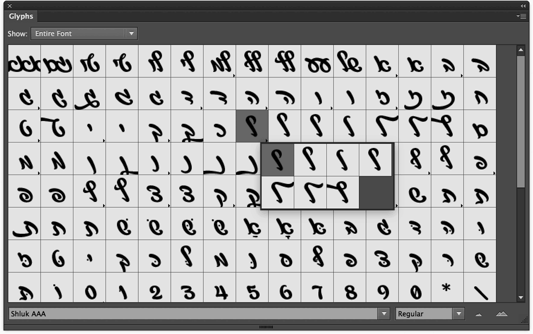
The Glyphs window on InDesign, Illustrator and Photoshop
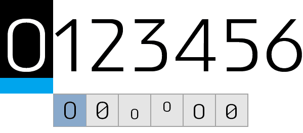
An additional, easy to use option has been recently added to Photoshop and Illustrator: select a single character, and if a bold line in blue or grey appears underneath it, it is a sure sign that this character has alternate glyphs we can select directly through the program’s friendly pop-up menu. This is how, for instance, marking the 0 character in Atlas Pro font would look like:
Illustrator
Illustrator has a panel dedicated to OpenType. It is available via the Window > Type menu, or with the keyboard shortcut Ctrl/⌘+Shift+Alt+T. The bright ”turned on” icons indicate that the feature is available for the font. In order to activate or deactivate a feature, we will simply select our text and click the icon of the feature. It’s that simple. The Small Caps option, along with several other features, is available for quick access on the familiar Character panel.
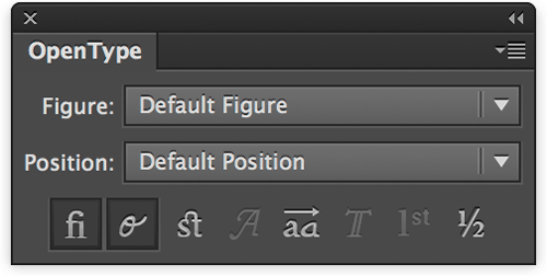
The Illustrator OpenType panel
Photoshop
The developers over at Photoshop made our lives easier, and decided to place all of the features in the Character panel. It doesn’t get any easier:
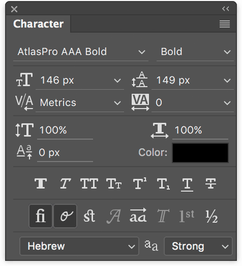
The Photoshop Character panel
InDesign
In InDesign, clicking the little menu icon at the top left hand side of the Character panel and selecting the OpenType option will display the font’s entire array of OpenType features (the ones that do aren’t typed in brackets).
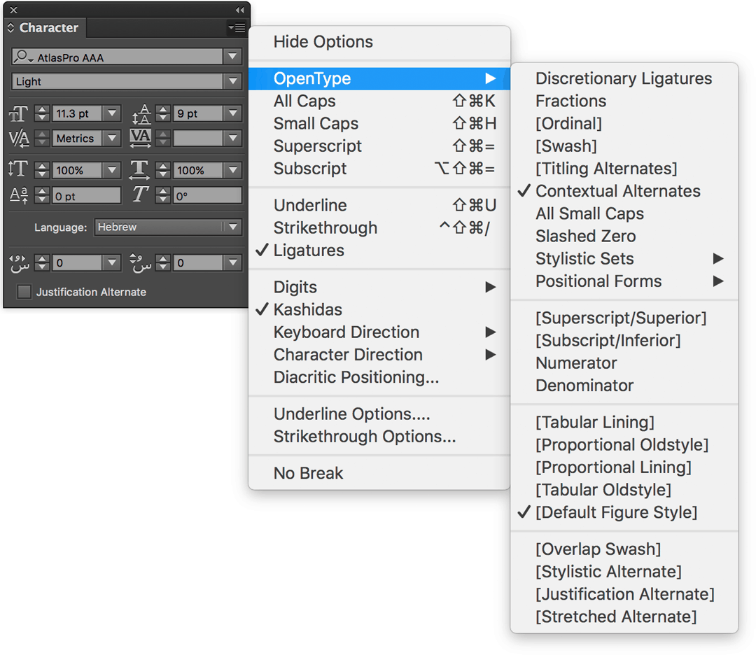
The InDesign Character panel
In addition, a cute, useful little icon has been added to the 2017 version (and up) at the bottom of the text window – giving that the font has relevant OpenType features. Clicking it will present the options available to us. Just look for the slanted “O”.
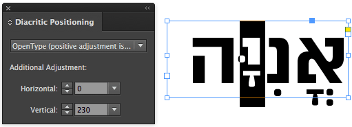
Bonus: InDesign has a useful little panel which isn’t actually an OpenType feature, but you will love getting to know it for sure – the Diacritics Position. This panel allows designers to place the font’s Niqqud according to their own preference. This is especially useful in slightly older generation fonts that didn’t get OpenType Niqqud (programmed niqqud) due to technical limitations. In newer fonts, however, OpenType Niqqud is much more commonplace, and even in fonts that have proper Niqqud, this panel allows everyone to place Niqqud more accurately to their liking. Via the main menu: Window > Type, gain access to Diacritics Position and do a little dance.
Other Adobe programs
Other Adobe programs do not have built in support for OpenType features (as of CC 2017 version). You can try writing your text in Photoshop and copying it directly into AfterEffects and everything will pretty much turn out properly (minus ligatures). This technique won’t work for Premiere Pro, so you’ll have to export and import if as a smart object.
Native Mac OSX programs
The Sketch program, which has become quite popular as of late, uses the Macintosh typography engine. This allows some OpenType feature support, but the access and use of these features is very uncomfortable in relation to the Adobe programs. How to access the Mac OSX built in Fonts panel, you ask? It’s pretty simple: Format > Fonts > Show Fonts, or use the shortcut ⌘+T. You can use the exact same panel for programs such as Keynote, TextEdit, Pages and more.
The OSX built in typography panel
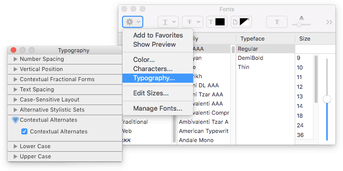
פאנל הטיפוגרפיה המובנה ב־Mac OSX
What about Webfonts?
When it comes to online live text, you will surely be happy to hear that there is excellent support for OpenType features on Webfonts thanks to CSS3. I’m not going to lie to you, there may be an occasional glitch, but support is getting better and better, and these days you can use almost all of the features previously mentioned on your websites. If you’re interested in hearing more about programming terminology, this CSS command is oftentimes called font-feature-settings, and it’s super easy to use:
In this example we activate the ligatures feature (1 or on to activate, 0 or off to deactivate). In this specific case, the ligatures feature is (almost) always on as a browser default so there’s no actual need to activate it, but this is basically the activation syntax – given that they exist in the font. Another thing you should know is that some of the features have specific CSS commands you should use – if we take ligatures for example, you should use font-variant-ligatures, and all will be well. But we’re getting into programming semantics (which is a great thing, but for a different forum) and so it is best to stay updated here about which CSS command works with which feature. Here you can find a list of commands that can be activated by code.
Well, that was long
If you have any notes, comments, requests, criticism or compliments, feel free to share and participate in the discussion.
Thanks to Eran Stern and Shavit Yaacov for their help in preparing this article.
If you wish to know more, here are some links to additional resources:
A guide for Illustrator OpenType features
Working with the Glyphs panel
A guide for Office 2010 OpenType features
Getting to know OpenType features on ilovetypography.com
OpenType on Wikipedia in Hebrew and in English
OpenType features for Webfonts, font-feature-settings, font-feature-settings, and also this
