In “The Headline” (Hebrew poem), the font that was used is Frank-Rühl. This is how Alterman seeks to describe the labor of the printing press worker when arranging the dramatic headline announcing the fall of Berlin, including the first and informal news of Hitler’s death. The poem was written in May 1945, as part of his weekly column in “Davar” (Hebrew newspaper). Despite the detailed description, such a headline has never been prepared or printed. Alterman understood the power of the letter, and why Frank-Rühl represents the very forces and values he sought to reinforce. He knew how these letters of such distinct character and personality carry tradition and memory alongside deep layers of Jewish culture and history.
Rafael
Rafael Frank was born 150 years ago (on March 11, 1867) in the German city of Ichenhausen, the son of an antique dealer. During his academic studies in Cologne, he became attracted to the Hebrew language and Hebrew music. In 1903 he moved to the city of Leipzig with his wife and two children and served as the chief cantor of the Jewish community. Thanks to his understanding of various languages and his training as a scribe, he worked in calligraphy and font design. In 1908, he was commissioned by Leipzig University’s “Evangelical Society for the Publication of Scripture” to design a Hebrew font to be used for secular Hebrew texts. Within about two years, Frank completed the design: a set of 27 Hebrew letters in one weight. The letter was cut in 1910 at a small letter foundry in Leipzig called C.F. Rühl, which later merged into the Berthold foundry which distributed and sold the letters to print shops throughout Europe. The font is called Frank Rühl Hebräisch, or in short, “Frank-Rühl”.

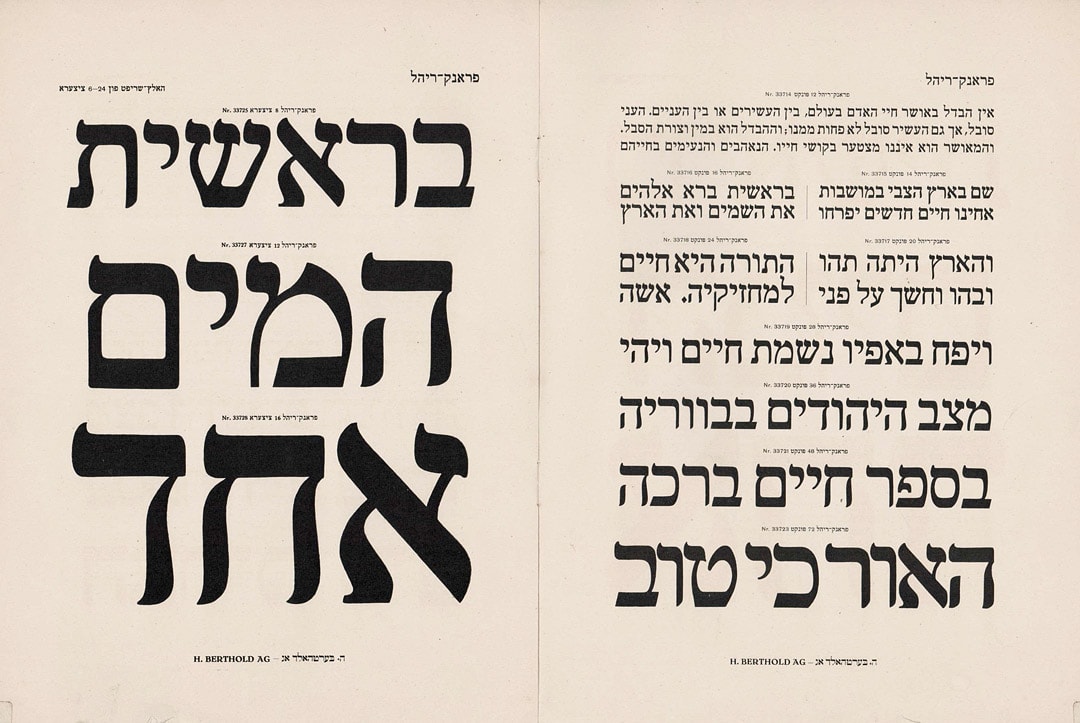
Frank-Riehl Speciman from the 1924 Berthold Letter Casting Catalog
Frank- Rühl
The font that Rafael Frank designed came into use in Germany and was later duplicated in other printing presses until it was adopted by the official press and printing houses in Israel. Itai Tamari, a scholar who specializes in the history of Hebrew typography, writes the following about the font:
“It is a letter that changed the Hebrew print. It is similar to a Spanish letter, a bit flashy and ornate. It was a new letter unrelated to any tradition – neither of the beit midrash nor the writings of the Haskalah. But surprisingly, even religious people used it. ”
Rafael Frank identified the need for a font style that differs from the types of letters that existed at the time when many secular Hebrew writings began to appear in print. The fonts that existed then – mainly the Vilna font, which was used for most of the printed Hebrew writings in that era – instilled a scholarly-religious tone. The new font was designed to fit modern print so that the reader could read long texts rapidly – with or without nikud (vowels). Frank argued that there was a need for quiet, continuous letters that would improve reading fluency:
“Unlike non-Hebrew letters whose design does not depend on any external factor, the design of a Hebrew letter must take into account the Code of Jewish Law (Shulchan Aruch),” Rafael said in an essay he published after the font was released. The rules of the Code of Jewish Law that originally pertain to the writing of Torah scrolls detail the shape, structure, and composition of each letter. Frank, being a certified scribe, knew these rules well and observed them rigorously. As a teacher, he knew how to update and change letters, based on pedagogical considerations.
“The quietness and stability of my writing are also guaranteed by the fact that none of the top strokes of the letters are skewed. (Letters can have several top strokes. For example, א has two, צ has two, and ש has three top strokes). The robust perpendicular lines remove the curvature, the lugs, and the jellyfish shape from the font and each letter appears intact with all its parts equal to each other “, he continued to write in the essay.
The letters’ design did draw inspiration and style from the Spanish Jewish tradition, which tended to decorate the letters with moderate and not too ornate serifs. The letter is based on an Italian print letter used mainly by Daniel Bomberg, a printer who operated mainly in the 17th century, in the spirit of the Art Nouveau movement.

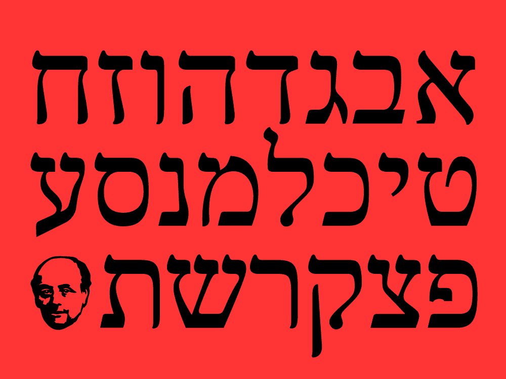
Frank-Riehl alphabet letters in Alef Alef Alef version
Culture
Once circulated, the Frank-Rühl font gained a central and undisputed status in printing houses across Europe, due to its shape and design style. The Zionist Movement, which emerged at the time, even adopted it as a font free of diasporic history. To date (almost 120 years later), it is the most widely used font in print and considered the official national font. Its proponents claim that it is highly readable, with its ” inconspicuous” and supposedly “transparent” letters that allow the reader to run through the text without dwelling on the letters’ design. They also claim that the difference between similar letters (ר and ד for example) is clear enough. Therefore, Frank-Rühl is used for printing many types of texts, from poetry books to daily newspapers.
On the other hand, quite a bit of criticism has been leveled at the font and its various incarnations. It has been claimed that the letters are too wide, heavy, and crowd the page with black ink. It is also said that there are suitable substitutes, such as Narkis, Hadassah, or David, and other modern alternatives for a running-text font.

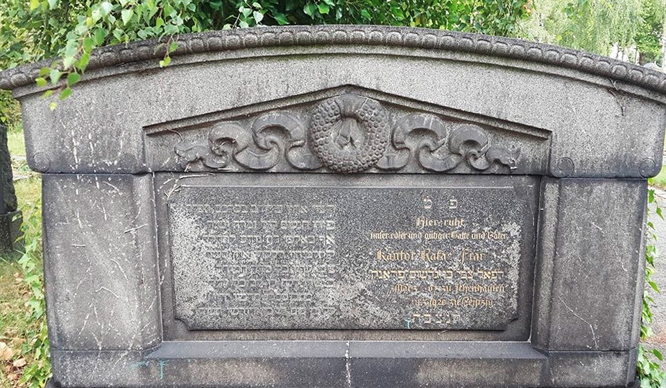
The tomb of Raphael Frank in Leipzig, Germany. Photographer: Efrat Tosia Cohen
In the late 1980s, an attempt was made to redesign the Maariv newspaper, and the graphic designer used Narkis instead of Frank-Rühl. This provoked negative reactions from readers, who were unaccustomed to the new font, and the paper reverted back to its original design.
The font is so deeply rooted in Israeli identity and consciousness, to the point that it has become fully associated with modern Hebrew culture. A few years ago, as part of his final project, designer Shai Golan enlisted the font as a representative of Israeli society compared to the Ariel font, reflecting the desire to blur the diasporic and aesthetic differences. In the project, Golan presents the fonts in a series of examinations in order to identify the changes Israeli society has undergone in the modern and global world.

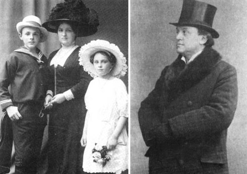
Rafael Frank on the right. Miriam (in the white dress), wife and son
Miriam Font
At the very same time, he was working on the design of the Frank- Rühl font, Rafael designed another font to serve as the bold weight for Frank- Rühl. This font has a uniform line thickness, slightly rounded corners, and simple letter shapes. Rafael named the font on after his young daughter – Miriam.
In 1920, only a decade after publishing the font, Rafael Frank died of a sudden illness at the age of 53. He was buried at the old Jewish cemetery in the city of Leipzig. Frank did not live to see his font, which was inspired by the Jewish tradition and carefully designed, be warmly embraced by the Zionist movement, and become a staple of Israeli society over the years in its various incarnations, whether in the diaspora or in the Jewish state.

