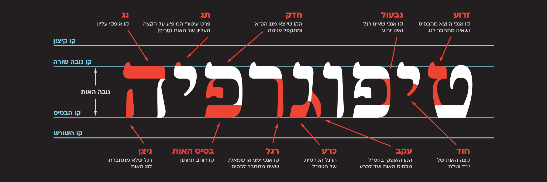
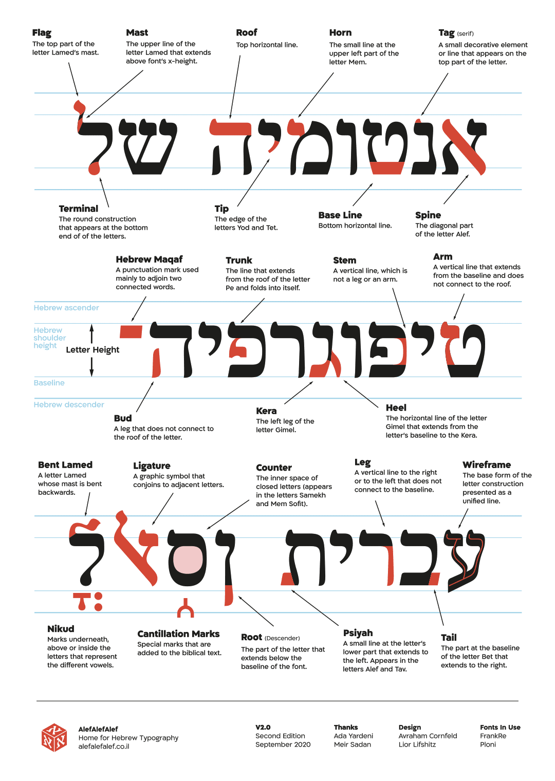
If we were to examine the differences between a serif font like FrankRuehl and a sans serif font like Almoni DL, the distinction would be evident to all. However, in other instances in which the two fonts share similar characteristics – the differences are more nuanced, and difficult to discern by an untrained eye. An important stage in training our typographic vision is examining the anatomy of the letters and learning to take note of the small details that differentiate one font from another. As in other professions, font designers have a vocabulary and glossary to help distinguish between the different parts of the letter. Of course, you don’t have to memorize the entire list, but it is recommended you’d get to know the basic terminology that allows you to talk about letters and recognize their features.
Attached is an anatomical diagram you can print in your home printer:
Glossary
Base Line — Bottom horizontal line.
Stem — A vertical line, which is not a leg or an arm.
Roof — Top horizontal line.
Flag — The top part of the letter Lamed’s mast.
Tail — The part at the baseline of the letter Bet that extends to the right.
Arm — A vertical line that extends from the baseline and does not connect to the roof.
Trunk — The line that extends from the roof of the letter Pe and folds into itself.
Tip — The edge of the letters Yod and Tet.
Terminal — The round construction that appears at the bottom end of of the letters Lamed and Qof in serif fonts.
Kera — The left leg of the letter Gimel.
Bud — A leg that does not connect to the roof of the letter.
Heel — The horizontal line of the letter Gimel that extends from the letter’s baseline to the Kera.
Psiyah — A small line at the letter’s lower part that extends to the left. Appears in the letters Alef and Tav.
Counter — The inner space of closed letters (appears in the letters Samech and Mem Sofit).
Horn — The small line at the upper left part of the letter Mem.
Leg — A vertical line to the right or to the left that does not connect to the baseline.
Spine — The diagonal part of the letter Alef.
Root (Descender) — The part of the letter that extends below the baseline of the font.
Tag (Serif) — A small decorative element or line that appears on the top part of the letter. (Sans serif = without serif)
Mast — The upper line of the letter Lamed that extends above font’s x-height.
**
Cantillation — Special marks or symbols added to the biblical text. These marks let the reader know the melody of the words or indicate a word’s proper pronunciation.
Bent Lamed — A letter Lamed whose mast is bent backwards.
Ligature — A graphic symbol that conjoins to adjacent letters.
Hebrew Maqaf — A punctuation mark used mainly to adjoin two connected words.
Niqqud — Marks underneath, above or inside the letters that represent the different vowels.
Wireframe — The base form of the letter construction presented as a unified line.


