
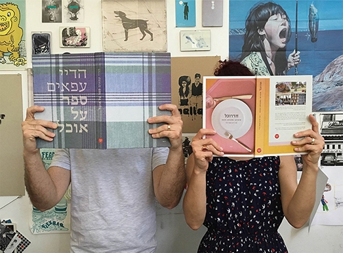
Abigail Rainer

I was born and raised in Jerusalem. Research studies appealed to me and I deliberated between the Hebrew University or Bezalel for art history studies. I decided it would be interesting to turn my love for the visual world into a profession. I graduated from the Visual Communication Department at Bezalel in 2007 and immediately after, I started working with Michal Sahar and Kobi Levy in the studio they shared in Tel Aviv, which became a second amazing school for me. The studio work focused on books and exhibitions design, so I was fortunate to be exposed to various artists, curators and cultural institutions. At the same time, I started teaching at Shenkar, and in 2010, I set up my independent studio, The Studio, together with my partner Shlomi, where I am mainly engaged in artists’ books and catalog designing, alongside designing cultural events and exhibitions. Together with my work, I was studying for a master’s degree in the Cultural Research Unit at Tel Aviv University, due to my feeling of lacking theoretical knowledge of my profession, or more precisely – a deeper understanding of “why we do what it is that we do, what defines our culture and why”. I recently graduated with cum laude.
How did you come to specialize in book design? Why books of all things?
I grew up in a book lovers’ home; my parents’ house is a huge and inexhaustible library (to this day, my father has to buy at least two books a week at second-hand stores …). The love for the written word, together with the pleasure of the sensory aspect of the book object – the touch of the paper, the smell of the print, the cover for its many dimensions – made me want to delve into this format. Recently, I realized that almost every project I did during my studies came down to a kind of paged format, even when it was not required… There is something paradoxical about this format – it allows for much in a very distinct range of boundaries. Out of all things, it is in this limited place of paper, text, square, etc. that I find a great deal of freedom of creation.
There is something paradoxical about this format – it allows for much in a very distinct range of boundaries.
What’s important to you when you design a book?
It is important for me to produce a desirable object. While this is an expression common in our domain, I think it is my starting point for any project. The work process raises questions for me in order to come up with such a product: What aspects of the book can win over the potential reader/viewer? How will the work of the artist be best portrayed and how can I represent it using the means available to me as a designer. Another thing that is important to me as a book designer is transparency. Since I work with artists whose work is to be the highlight of the project, it is important to me that the means by which I choose to present their work will not interfere but rather compliment and correspond with it. Such a process requires modesty in the design. Not every trend or design whim should find a place in an artist’s book.
One book whose design has been a special challenge for you:
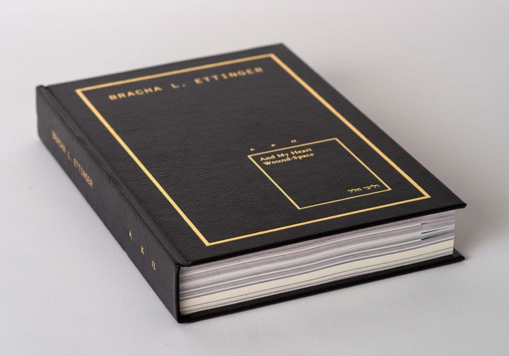
The artist’s book of Bracha Ettinger is the largest book we’ve ever designed in the studio, over 500 pages long. Bracha is an international artist and theoretician who presented a solo exhibition at the latest Biennial in Istanbul. Since an artist of this caliber published a great deal of catalogs, the challenge was to try to produce a “different” kind of book. This is why her artist’s book included many viewpoints different than usual, when in fact, no page included her works in their entirety: using close-ups of paintings and drawings, cutoffs of frames and sequences of various media types, we created a new perspective on them. Another challenge was the artist’s desire to put “everything” in – thoughts, inspirations, texts written by her and ones written about her. The book is divided into different chapters to create a variable graph of experiences, so that the viewer can experience points of “climax” and “anti-climax” and recover from the intensity of browsing. The work on the book was the result of excellent teamwork: Leah Abir (the book’s curator), Talia Halkin (the linguistic editor) and Zohar Koren (co-designer, who was a student of mine and currently works with me).
One book designer you admire:
I really admire the work of Michael Gordon. I see him as founder of artist’s books design in the country. We are very different in our line of design, but I draw inspiration from hearing and understanding his work processes.
Michael Gordon
I studied at the Graphic Design Department at Bezalel. Half way through my studies, I began to become exposed to the art that influenced me, especially from the transition stages of naturalist art through Cubism to the abstract, and to artists like Mondrian and Malevich. Through them, I realized that the page was a space that needed to be worked with using means and understandings more complex than those my studies offered. I was also influenced by primitive art, mainly African, and through it, from the work of artists such as Picasso, Jackson Pollock, and Joseph Boyce, through which I realized that the page was a space in which an “event” takes place. In addition, I realized that the design was fed by processes that took place and were assimilate in art, years before they were available as models and work materials by designers. This is why I prefer to be fed by unprocessed materials in a variety of areas that interest me; this allows me to work with the content of things, and reach solutions that are free from the influence of changing trends and fashions.
How did you come to specialize in book design? Why books of all things?
As mentioned, the processes I went through moved me away from the design world and brought me closer to the art world. On the other hand, I am, by training, a graphic designer and typographer, and this is my true territory of expression. I started designing and producing art books in a natural and smooth manner, where it all came together: work at a communication level that does not require incessant adaptation to one taste or another, but only loyalty to the work content. When I started, the field was in its infancy in Israel, the market was small and undeveloped – which allowed me a great deal of freedom and the opportunity to formulate methodology and work standards that suited me.
The book is the simplest, fastest, and most sophisticated way to bring ideas into culture.
What’s important to you when you design a book?
The book is the simplest, fastest and most sophisticated way to bring ideas into culture. Prophecies of its demise were made throughout the years, they came in waves and did not materialize, so the task is for the book to be timeless, to be worn-out and look vital and fresh, both physically and in terms of content. The physical survivability is clear, but the survivability of the content is far more complicated and requires study and delving and depends on the ability to produce a proper transformation of the contents into the medium of the book, so that it will have a parallel and relevant life over the years.
One book whose design has been a special challenge for you:
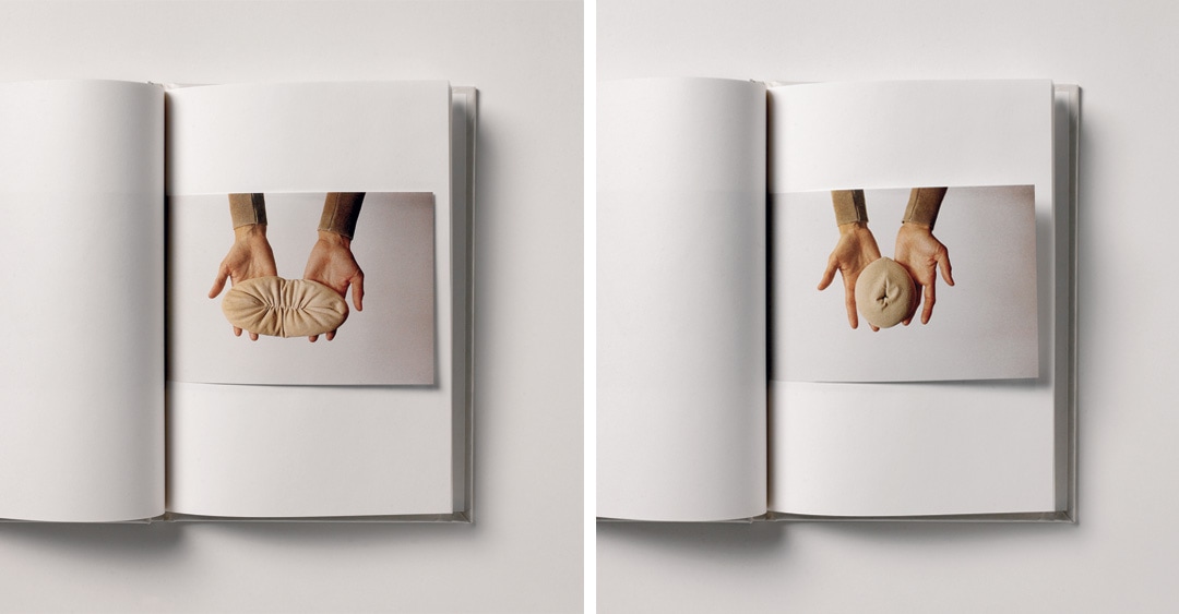
Mary Ange-Gimino’s Mes Poupées. The circumstances of the order were a project in a regional museum near Nantes in France. The museum asked artists to invite partners and I was invited to make a book, which will be an object in the exhibition. The budget was particularly tight and we decided to make due. The book contains 48 blank hardcover pages, in which 23 pages are inserted, showing the artist holding various works printed on a separate color sheet divided into 49 pages gathered in a specific order. This created 1000 sets of different images, so each book is different, highlighting its uniqueness. Dividing the spreadsheet created a size for all pages and it determined the size of the book. The representation of the works is illusory, it is not clear whether they are reproductions or objects, and their status affects the rate and form of browsing. The artist’s photographed hands refer to the browser’s hands and they are what provides the scale and the relationship between reality and representation. Because of the independence of the images, the reader can edit the images at will, which is reminiscent of the usual functional use of books, where flowers, butterflies and newspaper clippings are preserved, as well as association with correction pages (errata), which were once common. So, it is the simplicity and modest of the book, out of all things, that fills it with important and fundamental issues in my understanding of the medium.
My work is based on learning, dialogue, internalization and taking position
One book designer you admire:
My sources of inspiration are content oriented, and although I have seen wonderful designer works over the years, I have always drawn my solutions from within myself and from the knowledge I have acquired. I have no habit or need to see other people’s works or visit bookstores. My work is based on learning, dialogue, internalization and taking position. I don’t like it when a customer puts an example in front of me – as far as I’m concerned, it’s distracting, unhelpful, and I don’t need it. Initially, I appreciated the work of David Tartakover and Ilan Molcho, and I was influenced by the typography and materiality of the first issues of the Swiss magazine “Parkett”. Later, I started developing models for maneuvering between traditional typographic features and contemporary modes of representation and became interested in the work of Moshe Spitzer and “Tarshish” books. In 2009, I designed Gershom Scholem’s book “Magen David: The History of a Symbol” (which was accompanied by other articles), in which I maneuvered between classic typographic patterns (in the letter Shocken, to which I added niqqud), and between a complex representation of a few images, each of which has a different role and status. I designed the book as a tribute to Moshe Spitzer and his work as an editor and typographer and his contemporaries – primarily Gershom Scholem – on the exemplary humanistic and research culture they brought with them from Germany.
Noa Schwartz

I graduated from the Visual Communication Department at Bezalel in 2005. In the eight years following graduation, I was a partner and director of KN Studio, which specializes in designing catalogs and books for museums and galleries. Between 2010-2014, I headed the Graphic Design Department at Ron Arad Studio in London. Over the years I have had exhibitions in galleries and museums in Israel and around the world and have won various awards for my work (including the TDC Tokyo Merit Award for the Ron Arad Exhibition Catalog at the Holon Design Museum). Today, I own an independent studio in Tel Aviv, specializing in branding and designing catalogs and books, I teach at the Visual Communication Department at Shenkar, and am studying for a master’s degree in the Arts Interdisciplinary Program at Tel Aviv University.
How did you come to specialize in book design
As part of “Written Portrait”, my graduate work at Bezalel, I designed three books for three different people. I researched how to create and design a book for a particular person by using typography, layout, materiality, etc.
What’s important to you when you design a book?
The particularity of the design in relation to the book’s subject and materials. A situation whereby one can pour any content into the book, does not interest me.
One book whose design has been a special challenge for you:
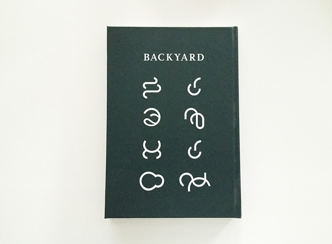
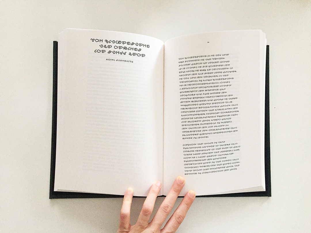
It was fascinating to work with the artist Uri Katzenstein on the “BACKYARDS” exhibition catalog. Uri is known as a perfectionist and many people advised me not to get into this project. This was a bit daunting, but as soon as we started talking about the catalog we had a fascinating and productive dialogue that continued throughout the process. Another challenge was the creation of the font “BACKYARDS” (in collaboration with Ilya Yasinov), which was based on a manual font that Uri created years ago and accompanied him in various works.
One book designer you admire:
Ronnie Schneider redesigned Stephen King’s novel “IT” during a book design course I teach at Shankar. The book’s design, a winning combination of intelligence and emotion, was precise and very well-made. It’s one of the finest works I’ve come across in a long time.
Keren Gaffney and Golan Gaffney
We studied in the Visual Communication Department at the Holon Institute of Technology. After about a year of working as employees we decided to go on our own independent way, together. Our studio operates since 2006. Right from the start we have been looking for our way in the world of culture and art, and today, a big chunk of our work is in these areas. One of the first projects of the studio was actually a non-profit project – A5 Art Magazine – which we edit, design and publish to date, together with designer Tali green. Another field that has a place of honor with us is the culinary field – the connection between food and design is great fun, and we celebrate it mainly with the book publishing Lunchbox as its inhouse designers.
How did you come to specialize in book design?
We love books. The smell of the new paper, the yellowing of the aging paper, the connection between text, image and object, and the experience of turning a page and discovering a world.
There is no book we designed and did not read. For us, design is an integral part of the content – influencing it and influenced by it
.
What’s important to you when you design a book?
First of all, to read it. There is no book we designed and did not read. For us, design is an integral part of the content – influencing it and influenced by it. Then – the typography. Our main design tool: choosing fonts, adhering to sizes, spacing, hierarchies and ease of reading. And in addition – the browsing experience – It’s important for us to create an interesting rhythm in the double-to-double transition and to relate to the complete experience from the first page to the last.
One book whose design has been a special challenge for you:
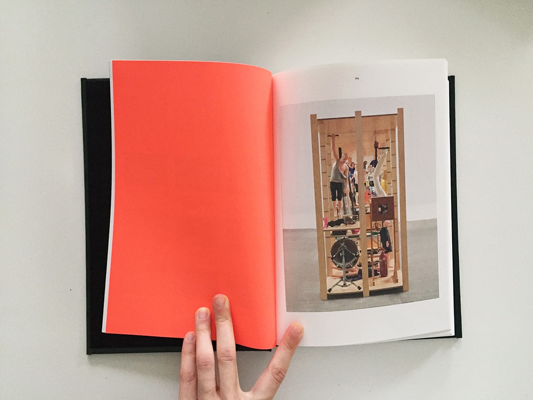
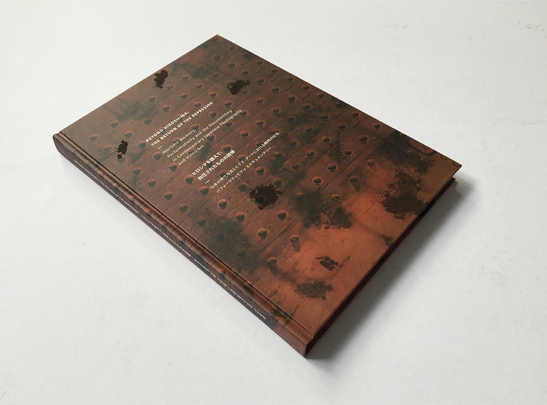
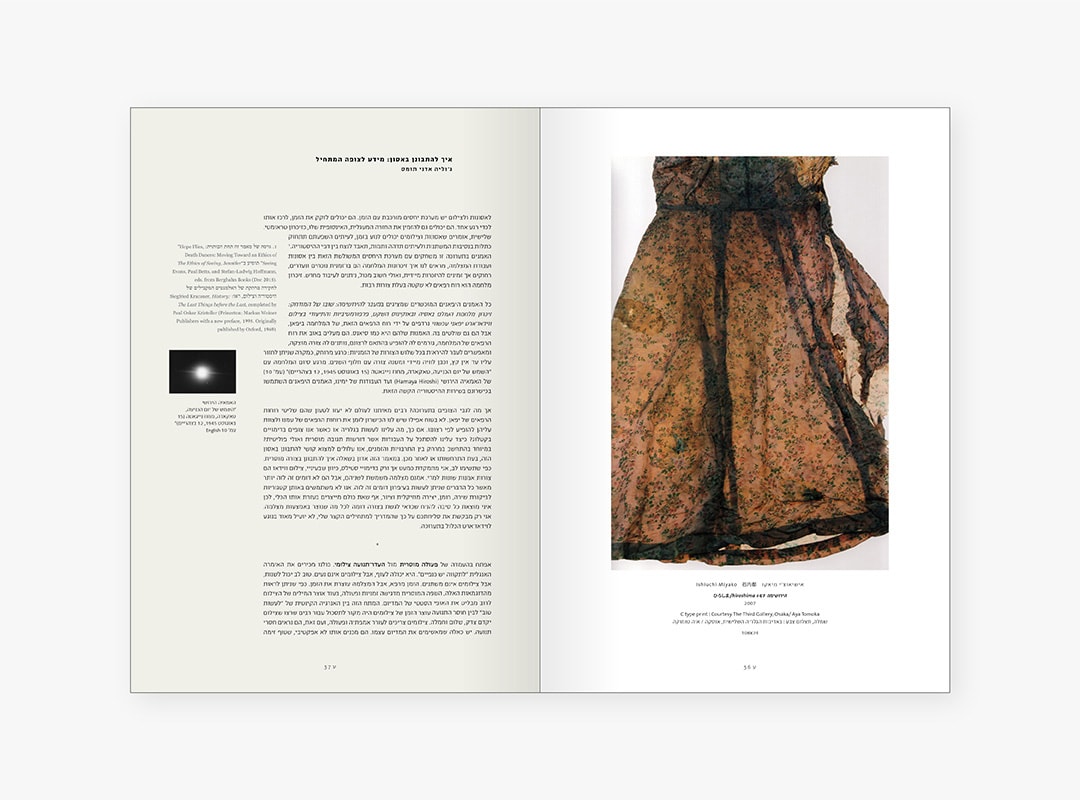
The catalogue of “Beyond Hiroshima” exhibition, held at Tel Aviv University’s University Gallery in 2015, was one of the most complex projects we designed. The catalog is spread over 280 pages and consists of three parts in Hebrew, English and Japanese. Between the Hebrew part and the parts of the other languages, the sequence of works, whose details are written in the three languages, unfolds. The challenge was to connect three languages, one of which we do not understand (unfortunately), to find typographic solutions for different types of texts and different hierarchies of information, in the thought of bi-directional browsing (Hebrew opening and Latin opening), and in arranging the work sequence in a non-linear way, but rather, one that produces interesting connections between the works and creators.
One book designer you admire:
Michael Gordon. Every book he designs is a textbook for us. He is a great inspiration in typography and grid structure. He knows how to express loads using the minimum, and create accurate and timeless typographic sets. Everything just looks right and natural and the truth is that it’s really not easy to do.