It seems as though the online revolution is complete. The internet has become almost as relevant and as much of a given as the physical reality that surrounds us. Yet, in the early 2000s, the typographic knowledge in Israel was still personal and scattered, and those seeking to learn needed to adapt themselves to exclusive academic or commercial settings, or alternatively to seek out the few mentors we reviewed in the previous articles.
The forums and communities that were established in the late 1990s and early 2000s became central gathering points, spreading knowledge and creating a new reality. This reality changed the physical and cyber surrounding, and in doing so became a wellspring of new opportunities for the next generation of creative individuals. The first examples of this new depth of information on the Hebrew letterform was the website ‘Hebrew Typography’ set up by Prof. Sivan Toledo, the ‘Sting’ website set up by Meir Sadan, and ‘The Font’ website set up by Sadan together with Ben Natan. Natan also founded the ‘Fontia’ in which he shared the fonts he created as an amateur with the general public free of charge (as did Meir Sadan and Daniel Levy). Some of these free fonts can still be found today, mainly on store signs, throughout Israel. In the ‘Visual Communication’ forum (and in the ‘Typography and Fonts’ sub-forum group) on the Tapuz website, the first explorations of the culture of digital typography began. In these communities, photographs of student exhibitions and reviews of works and innovations in the field were published. Eventually, these amateurs grew to become professionals who helped redefine Hebrew typography.
At the beginning of the current decade, the field of graphic design as well as Hebrew typography, which had been considered a small niche, became an integral part of the overall conversation on visual culture. Since then, the general public has not only become a consumer of visual communication, but has grown to have an opinion. Visual communication and design journalists have contributed to websites and blogs, and not merely for the niche professional audience. Oren Fayette (the past director of the ‘Visual Communication’ forum on Tapuz) opened the ‘Samlil – Hebrew Branding’ website, and regularly published high-level reviews on branding, Israeli design, and typography. The Regba brand, together with Feelternet Studio, opened ReDesign magazine (which closed three years ago). Oded Ben-Yehuda began writing his column ‘Graphic Buster’ on Yediot Ahronot’s Xnet website in 2011. Yuval Saar, who was the design correspondent for the ‘Galleria’ magazine, opened the ‘Portfolio’ blog back in 2005, and later rebranded it as a contemporary magazine on various design disciplines. Avraham Cornfeld and Talia Seligman started ‘Untitled Magazine’ in 2009, in which an active column on graphic design and typography was published. The author of these lines opened the ‘Bureau of Hebrew Typography’, the largest database of knowledge on the subject, in 2012. Today, the collaborative situation in which dozens of people spend their time and energy on the joint development of the field has significantly dropped, and typographic discussions and collaborations take place mainly in private Facebook groups and on a few social media posts of graphic designers from all media.
 Ben Nathan
 Ben Nathan
Ben Natan is a graduate of the Department of Visual Communications at the Bezalel Academy and currently a typography educator at the Holon Institute of Technology. He started designing fonts at the age of 15, and shared them for free in ‘Ben’s Fontia’, which opened in 1999. About his beginnings as a young typographer, Ben says: “I started designing fonts simply because there were none. The Israeli internet was young, and gathering inspiration from websites like Ray Larabie’s and other Americans who made online fonts at the time, I decided to make my contribution too, and I started the ‘Fontia’, which served as my typographic playground for almost a decade, until I started my studies at Bezalel. On the ‘Fontia’ website I made all the fonts available for download and for personal non-commercial use, so that other amateur designers like me would have more fonts to use, and of course for the love of the Hebrew letterform”.
After years of designing fonts for the internet, Ben decided to study design professionally and at the age of 24 he closed the ‘Fontia’ and began his years of study as a student of visual communications at Bezalel Academy. It was only when he started working on his final project that he decided to return to font design with a proposal for a Hebrew italic font, based on the ‘Shabtai’ font he designed in Michal Sahar’s font design course.
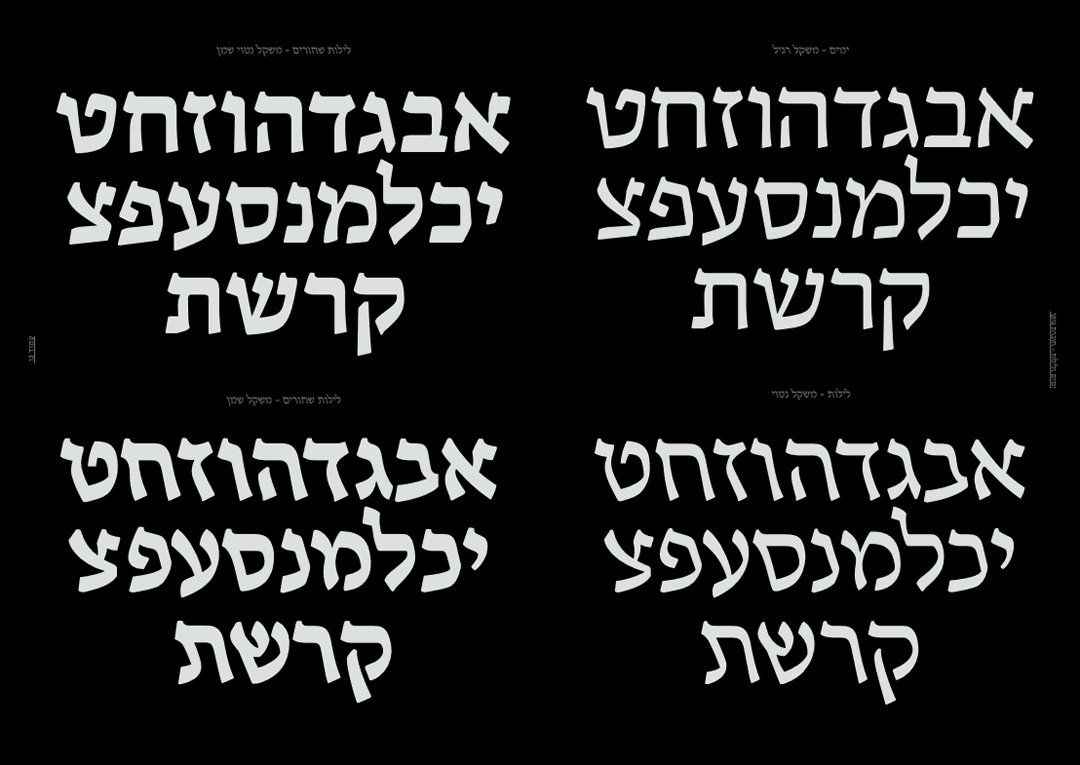
“I started with the ‘Shabtai’ (‘Saturn’) typeface, and based on that created ‘Yamim’ (‘Days’), which is a more natural font for reading and arranging text (while ‘Shabtai’ is more suitable for headlines), and as a contrast to ‘Yamim’ I designed the ‘Leilot’ (‘Nights’) font, the same font in an italic weight. The ‘Yamim & Leilot’ typeface was released in regular and italic as part of the final project, and later I continued working on it and designed heavy and heavy italic styles. The fonts won the prestigious TDC award in the category of ‘foreign languages’ as well as the ‘Bezalel Academy Department of Telecommunications Award for Typography’.”
Later, Ben also designed a sans-serif font called ‘Danideen’ and a title font called ‘Baselet’, and then went on to design ‘Assistant’ and ‘Amatica’ for the Google font library. He designed custom fonts and typefaces for the ‘Keshet’ Channel, the betting company 888, and more.
Ben concludes: “When I design a new letterform I usually base it on historical sources. For example, the design inspiration for ‘Days and Nights’ is an eighth-century Herodian inscription. Having said that, each letter design project is unique. Sometimes I’ll try to let loose and make mistakes (like when I designed ‘Amitica’, a fun headline font). ‘Assistant’, on the other hand, went through a six-month process to make it look effortlessly flawless.”
Avraham Cornfeld
 Avraham Cornfeld
Font designer and design lecturer in font design at Shenkar College, graduate of Shenkar and Hadassah College. Avraham grew up in an ultra-Orthodox family in the Old City of Jerusalem, and in his youth he learned from his father, an amateur Torah scribe (Sofer Stam), the craft of writing scrolls and mezuzahs. In his late teens, he left religion with most of his family, and at the age of 15, he began designing and programming websites. After that, he continued his studies in the Department of Photographic Communications at Hadassah Academic College in Jerusalem in the years 2004-2006, and in the Department of Visual Communication at Shenkar in the years 2006-2010. While studying at Shenkar, he initiated a number of independent design projects, the most significant of which is the magazine ‘Untitled’, which he founded and edited with Talya Seligman. In addition, in those years he also designed and developed first versions of some of the fonts that would be launched later as part of the AlefAlefAlef catalog, including ‘Atlas’ (initially called ‘Redial’), ‘Synopsis’, ‘Almoni’ (‘Anonymous’) and ‘Ambivalent’ (designed as part of the Event design of the 2011 Shenkar Graduate exhibition). For his final project, Avraham designed a Hebrew font called ‘Datlash’ (an acronym for ‘Formerly Religious’) – a semi-religious, semi-secular font that also included a slanted version. After graduating from Shenkar, he took a sabbatical year, which he devoted to improving the fonts he created during his studies and to establish the AlefAlefAlef group.
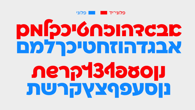
Over the past decade, Avraham has designed many Hebrew and dual-language fonts as part of his work at AlefAlefAlef, including a ‘Mekomi’ (‘Local’) font (based on the skeleton of ‘Frank Ruehl’), ‘Asimon’ (‘Token’), ‘Frank Ruehl Eccentric’ and ‘Mikhmoret’. The ‘Almoni’ (‘anonymous’) font he designed was first launched in 2011 and very quickly became extremely popular – thanks to its formal simplicity and dual language support, and due to the fact that it was one of the first Hebrew fonts designed and adapted for display on screens. He recently launched a ‘Brother Font’ to ‘Almoni’ called ‘Ploni’ – a sans-serif, geometric and neutral font, and ‘Ploni-Yad’, a cursive (handwritten) version of ‘Ploni’, thus enriching the ‘Ploni’ family. Cornfeld is currently working on a slanted version of ‘Frank Ruehl’ which is expected to be released at the end of the summer.
According to Avraham, “every font is a work of art that becomes a useful technological raw product.” He makes sure to develop a new version of each font every few years, so that it does not become less useful as a result of technological changes and developments in the field of graphic design. “Once I finish designing a font and bring it out into the world,” says Cornfeld, “even though the font comes in a digital file configuration, it has a life of its own. It is affected by time changes and accelerated technological advances. Since we are dynamic people who are constantly changing, it only makes sense that our works would be as dynamic as we are, and as such, they will continue to evolve and perfect with us. That’s why it’s important for me to release new versions whenever I feel a particular font needs updating, even if it comes at the expense of a new font that I could be developing.”
 Eliyahu Freid
 Eliyahu Freid
Eliyahu Freid is an ultra-orthodox font designer based in Beit Shemesh. Freid did not attend design school – he was self-taught. “I began working as a graphic artist, and I suppose every designer eventually finds themself in the niche that they are most connected to. For me that was typography” he writes. “I would spend hours typesetting, working meticulously until I was pleased with the results. It doesn’t always feel like you’re learning at the moment, but when you try again and again, you will inevitably learn from your mistakes and improve. I started sharing my work (Back then via the ‘Tapuz’ forum, with Daniel levi, Ben Nathan and Meir Sadan.) The conversations that we had on the forum inspired me to continue exploring and experimenting with type.”
In 2004 Freid began to sell the fonts he designed through Masterfont (50 fonts altogether), a few of which are ‘Charsina’ (‘Porcelain’), ‘Minshar’ (‘Manifest’), ‘Mishkanot’, ‘Tachshit’ (‘Jewelry’) and ‘Mechaot Poster’ (‘Protest Poster’). Shortly after, in 2009, he started the ‘Fontype’ font group together with his business partner Shimon Bergman, and they released their first catalog in 2010 (a booklet with 60 typefaces). Their font foundry offers a wide range of multi-weight fonts, among them sans-serif fonts, like ‘Nefesh’ (‘Soul’) and ‘Noyletter’ (‘New Letter’), and serif fonts that are extremely popular in the ultra-orthodox sector, like ‘Penina’ (‘Pearl’) and ‘Frankfurt’. In 2012 they released a significant catalog, and since then they’ve continued to display and sell their fonts online. In addition, ‘Fontype’ sells a selection of ‘Palron’ fonts, a collection of fonts designed in the 1980s, including classics like ‘Frank Ruehl’, ‘Rashi’, ‘Vilna’, ‘Stam’ and ‘Dor’.
They will soon be releasing a sans-serif dual-language typeface called ‘Type’ for article and magazine text, inspired by typewriter lettering. The font will include six weights, and it reflects Freid’s desire ״to design simple, transparent fonts, attempting to reach a typeface that is refined and precise.״
Daniel Grumer
 Daniel Grumer
Daniel Grumer, a 32 year old designer, completed his design studies at Bezalel Academy in 2014. For his final project he designed the ‘Avraham’ font, a dual language Hebrew/Arabic font inspired by the similarities between the two languages, aiming to show the two side by side equally. The inspiration for this project stemmed from the challenge of designing local street signs without needing to choose one language to place before the other.
After finishing his studies at Bezalel, he earned his master’s at the Royal Academy of Art, where he refined the ‘Avraham’ typeface. Once he completed his studies, he designed Hebrew versions of multiple Latin fonts, like ‘Zico’, ‘October’ and ‘Ping’.
Nowadays, Daniel teaches at Bezalel and collaborates with type design studios in Israel and internationally, like ‘Fontef’, ‘Typotheque’, ‘Lineto’, ‘Commercial’ and ‘Black Foundry’.
Other Creators
In this series of articles, we’ve listed typographers whose main body of work is type design. In addition to them, there are many more creatives that deserve mentioning. These individuals currently design typefaces in addition to their broader work in graphic design, education or research.
Eran Bachrach
2002 graduate of the graphic design department in Shenkar-Vital College. After completing his studies, Eran founded the ‘Bee Creations’ design studio together with Ido Tzemach. Eran taught himself type design, and the first font he designed was created for an industrial design student in Ascola Meimad and later purchased by the ‘Beep’ broadcast channel. He continued to design additional fonts that he then sold through various font companies. Notable fonts of his include ‘Socialism’ and ‘Ronibi’, for which he is now working on a dual-language version that will be released when completed under a new name.
Bachrach defines his work as ‘Typo-Practica’, meaning typography that attempts to address current needs in the market. “These days it isn’t practical to release a new font without including dual-language support, multiple weights, and various open type features. These are a necessity for today’s client.”
An example of a font of his that meets the ‘Typo-Practica’ standard is ‘Stanga’’, which was created to fill a need for a Hebrew typeface that was both round and narrow. The need for a font of this sort was great, and it quickly appeared on countless food packages and on television commercials. Two impressive projects that were released recently are the custom brand font that ‘Bee Creations’ designed for the ‘Ravit Zemach Law Team’, and the Hebrew version of the custom brand font for the Volkswagen corporation.
Meir Sadan

Meir Sadan is a true autodidact and child of the internet, who taught himself anything and everything that interested him as a child, ranging from HTML to typeface design on ‘Fontographer’. Meir started the ‘Oketz’ (The Sting) blog in 1996. Through the blog he published information about Hebrew typography and shared a collection of free fonts that he had designed in his youth. In 2008 he completed his bachelor’s degree in Visual Communications at Bezalel. At this point, he had acquaintances and colleagues from all over the world through the conversations he led on the online typography forums and communities, and he continued to collaborate with these colleagues on all sorts of projects as a prominent designer in the Israeli scene throughout his career. An example of this are the two Hebrew fonts that he developed for the Google font library – the ‘David Libre’ font, and the Hebrew version of the Latin font ‘Rubik’. ‘David Libre’ was designed meticulously together with Helen Brandshaft, after Sadan managed to convince those responsible for the Google font library of this font’s typographic significance. This version of the font is of very high quality and true to the original, while being updated and fresh, and it seems as though perhaps it did not receive the attention it deserves.
Noy Neiman
Upon finishing his studies at Bezalel in 2002, Neiman worked for Philippe Boulakia at the ‘Neo Group’ Branding Studio. In 2005 he joined forces with Hila Amram and the two opened a design and branding studio called ‘Kiosk’, which operated for four years. In 2009 he opened ‘Studio Neiman’, a brand design studio. In 2004 he designed the font ‘Drive In’ (as a student in Bezalel) and sold it through ‘Fontbit’. Later he designed ‘Penelope’, and in 2011 he designed the ‘Noyland’ font. He designed the ‘Barlev’ font together with Nadav Barkan in 2012, a title font with a grotesque style build and very refined and solid characteristics.
Shavit Yaakov
Shavit Yaakov grew up in Afula and completed his Visual Communication studies at Goren School of Graphic Design in 2017. Upon finishing his studies he joined the ‘AlefAlefAlef’ team with the font ‘Shluk’ (‘Gulp’) a stylized calligraphic font that gained great popularity. Next, he helped create the ‘Fontimonim’ Catalog, which includes four fonts of Yaakov’s design – ’Benchmark’, ‘Trebelsi’, ‘Ginger’ and ‘Shavis’. While working at the ‘Firma’ studio, Shavit designed the ‘Meah Sans’ (‘One Hundred Sans’) font for the Centennial Celebration of the ‘Haaretz’ newspaper.
Liron Lavi Turkenich
Liron Lavi earned her bachelor’s degree in visual communications at Shenkar College and her master’s in the Typography & Graphic Communication program at the University of Riding. She designed ‘Makeda’, a tri-language font with support in Hebrew, Amharic, and Latin, which all blend together harmoniously while each stays true to their individual shape. She also designed the Hebrew version of the Google font ‘Bellefair’. Today she teaches and leads workshops internationally at typography conferences, publishes papers, and develops the ‘Aravrit’ font project, connecting The Hebrew and Arabic languages through typography, attempting to close the gap in understanding between the two languages.
More
Professor Adi Stern
Stern graduated his Visual Communications studies at Bezalel in 1992, and continued on to study Typeface Design at the University, where he completed his studies in 2003. Today Stern is a design lecturer and the Head of the Department of Visual Communication at the Bezalel Academy. He designed a custom Hebrew font for the signage system of the Holon Design Museum. Over a 13 year period he designed ‘Noam’ – A dual-language text font sold by the Czech font foundry ‘TypeTogether’. His work has won many awards, including the prestigious ‘Tokyo Type Directors Club – TDC’ award for the font he designed for the Holon Design Museum. He has advised many international corporations in the matter of font design, including Microsoft, Linotype and Monotype.
Itamar Natan (aka ‘Beit Alef’) A true ultra-orthodox renaissance man, who has lately been advancing his impressive collection of classic Hebrew letterforms that he created, like ‘Prague’, and ‘LeBe’ (inspired by ‘LeaVa’), in a catalog called ‘Treasury of Hebrew Typography’.
Ofir Shavit, A programmer by training, he developed the online font program ‘FontArk’ which allows one to create fonts based on a letterform. He uses this program to design, which he occasionally shares in the ‘Typographics’ online community.
Yaki Hassid, Designer, educator, and calligrapher. Designed fonts using ‘FontArk’, and translated and created various educational materials on Hebrew typography and typography at large.
Moshik Nadav, Israeli born designer currently based in New York. During his design studies, he designed the ‘Moshik’ font that has a clear serif shape and distinct line contrast, giving the letterform a combination of fine lines and bold shapes. Nowadays, for the most part, he designs Latin fonts.
Ayal Baumert, designed a collection of fonts during and following his Visual Communication studies in Shenkar, the prominent among them ‘Baba’ and ‘Avigul’ (originally named ‘Abigail’) that are sold in the ‘Fontimonim’ collection.
There are other creatives whose names can be mentioned here as well, who designed one or multiple fonts that are distributed through the various font shops.
Calligraphy and Lettering

In addition to the type designers, it is also worth mentioning the thriving scene of Hebrew lettering and calligraphy designers, who have a great deal of influence on Hebrew typography, like Izzy Pludwinski (who has been active in Israel since 1980,) Hen Macabi, who designed two cursive, flowing calligraphic fonts, ‘Eretz’ (‘Land’) and ‘Chandelier’, Guy Tamam, who teaches Calligraphy at Shenkar, and Eliyahu Misgav, who taught calligraphy at the Holon Institute of Technology, Anna Zakai, Omri Avraham, Shavit Yaacov, Gal Sonnenfeld and many more.
Academic Research
In the field of academic study of Hebrew typography, we can name Professor Adi Stern, Ada Wardi, Yehudah Hofshi, Noam Schechter, Philipp Messner, Liron Lavi Turkenich, Alec Mishory, Shani Avni, Stav Axenfeld, in addition to the editors and the author of these lines – Elad Yana and Yaronimus.
More in the series:
Part One: Pioneers of the Computer | Part Two: Pioneers of the Internet | Part Three: Children of the Web
Epilogue
Our story ends here with this magazine article and in this moment in time, and will continue onwards from now moving forward. This renaissance has just begun. This partial snapshot is a sort of time capsule, that I suppose will seem outdated in a few short years. The typography community in Israel is flourishing, growing and becoming increasingly significant to the Israeli and the Hebrew culture, and I am certain that there will be more to observe as time goes on. The development of technology will likely make the font creation process easier and more diverse, while there will surely never be a substitute for true knowledge and skill. New font designers will emerge, and their work may at first seem strange and immature, but over the years they will teach us important lessons and continue to develop Hebrew culture. This is due to the fact that the designers of Hebrew typography are visionaries and pioneers, who stand on the shoulders of giants and succeed in flowering the wilderness in the only place in the universe known to man where Hebrew culture is breathed, lived and developed.
About the author:
Yaronimus is a graphic designer, Hebrew typography lecturer and researcher, calligraphy and lettering creator, and design writer, currently studying for a master’s degree in visual communication at Bezalel. The blog “Bureau of Hebrew Typography” which he created collects and distributes many materials, some of them exclusive and rare, that deal with Israeli typography in an in-depth way, which will allow readers of this series to deepen their research in the field of the Hebrew letter.
Translated by: Ariela Hyman