The Hebrew language is ancient, yet at the same time it is alive, changing and evolving. After centuries of dormancy, Eliezer Ben-Yehuda arose and breathed life back into it. Since then, Hebrew has not remained static, but has continued to grow and transform together with Israeli culture and society.
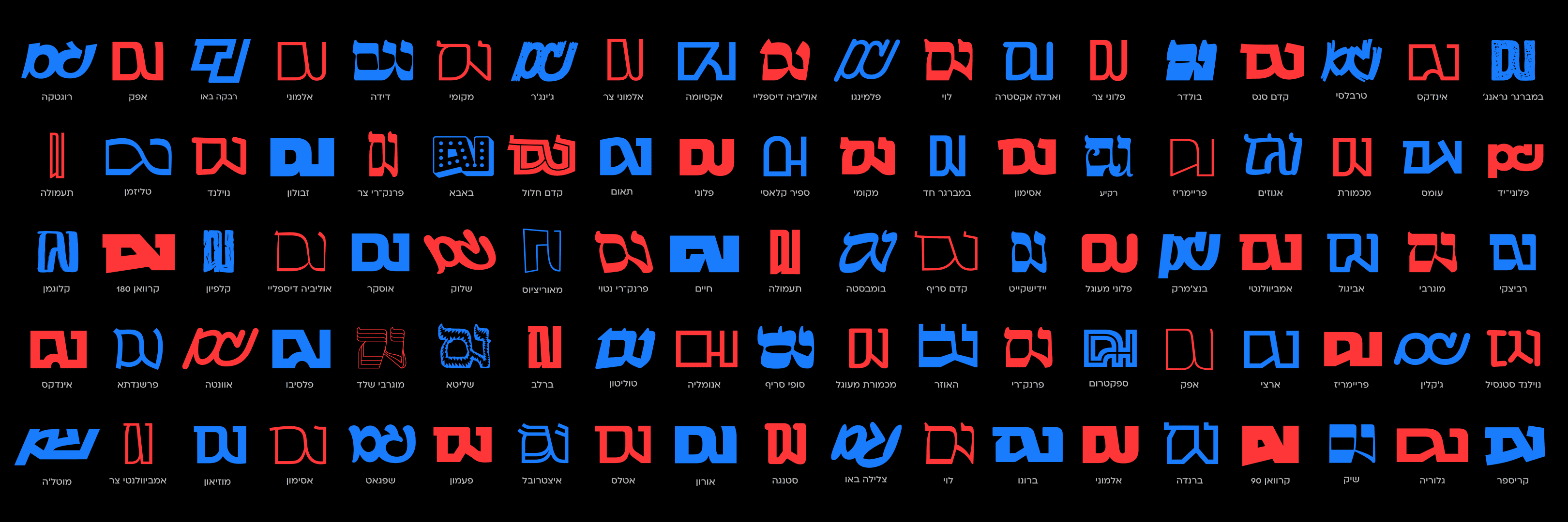
Examples of situations where the “VeGam” sign could be useful.
Like any living writing system, some symbols and characters disappear over time, while others emerge in response to new needs. One of the greatest strengths of a language is its flexibility and its ability to adapt to a changing world. Even with all its historical and cultural richness, Hebrew still has room for additional elements that could make it more precise and expressive.
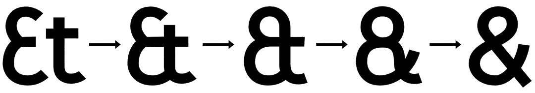
When comparing Hebrew to the Latin writing system, it’s hard not to envy the typographic richness available to Latin-script users. Beyond uppercase and lowercase letters, diacritics and unique symbols, they also have the ampersand (&) – both beautiful and highly functional. It began as a French ligature of the letters et (“and”) that gradually merged over the centuries into a new character recognized worldwide.
Interestingly, the word et once made its way into Hebrew as the word “את”, and even today it occasionally appears in the names of partnerships such as “Cohen et Levi”. This usage, influenced by Romance languages, conveys the meaning “and”.
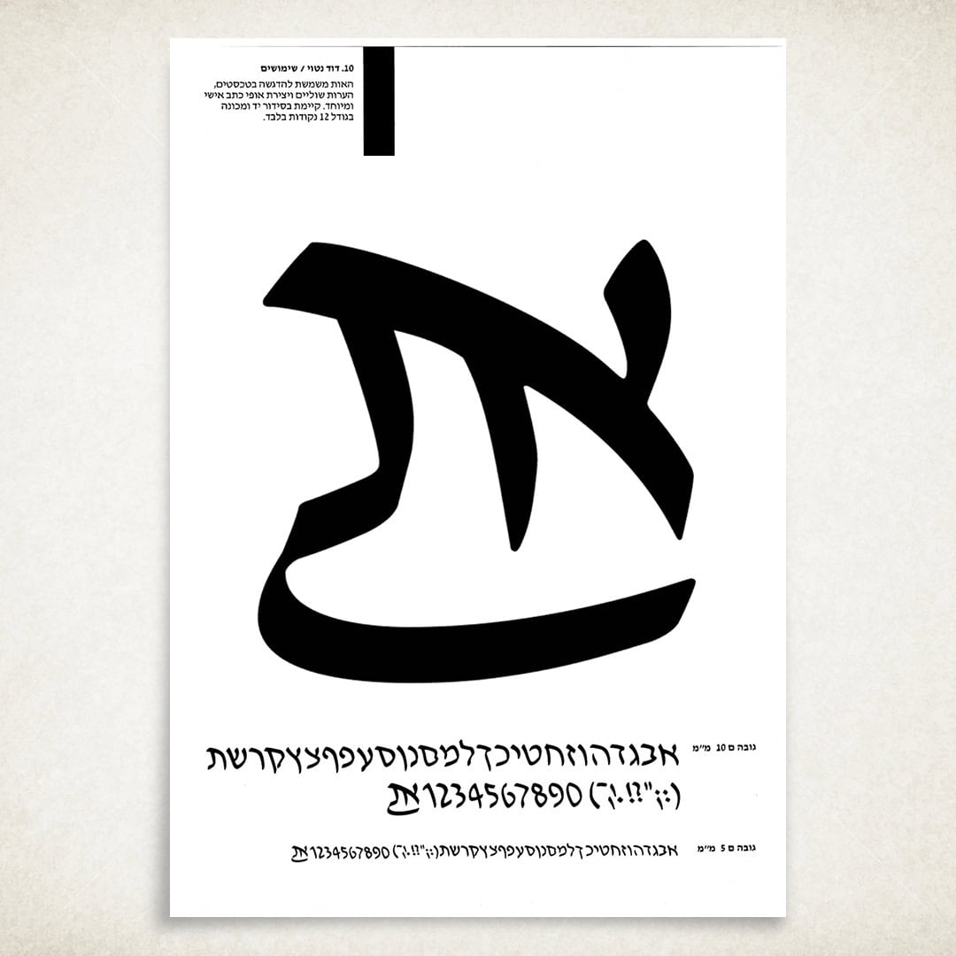
The Hebrew “et” sign in the italic David typeface.
Until the end of the nineteenth century, the ampersand was taught as part of the Latin alphabet and placed at the end of the sequence. When English-speaking children in England recited the ABCs, they would finish the song by singing “and per se and” – meaning “and, by itself, ‘and’”. Over time, this phrase blended phonetically into the single word we know today: ampersand.
The ampersand is not only elegant, it is also practical. It saves space, adds visual interest and is used in many languages (including Hebrew on occasion) to represent the word “and” in a simple, aesthetic way. And it’s a symbol we very much lack in Hebrew.
Yes, we do have the letter Vav (ו) as a conjunction, but visually it is minimal and clings to the word that follows, which can create readability issues.
So why not use a single graphic symbol – clear, efficient and aesthetic – that solves the problem?
The “VeGam” sign
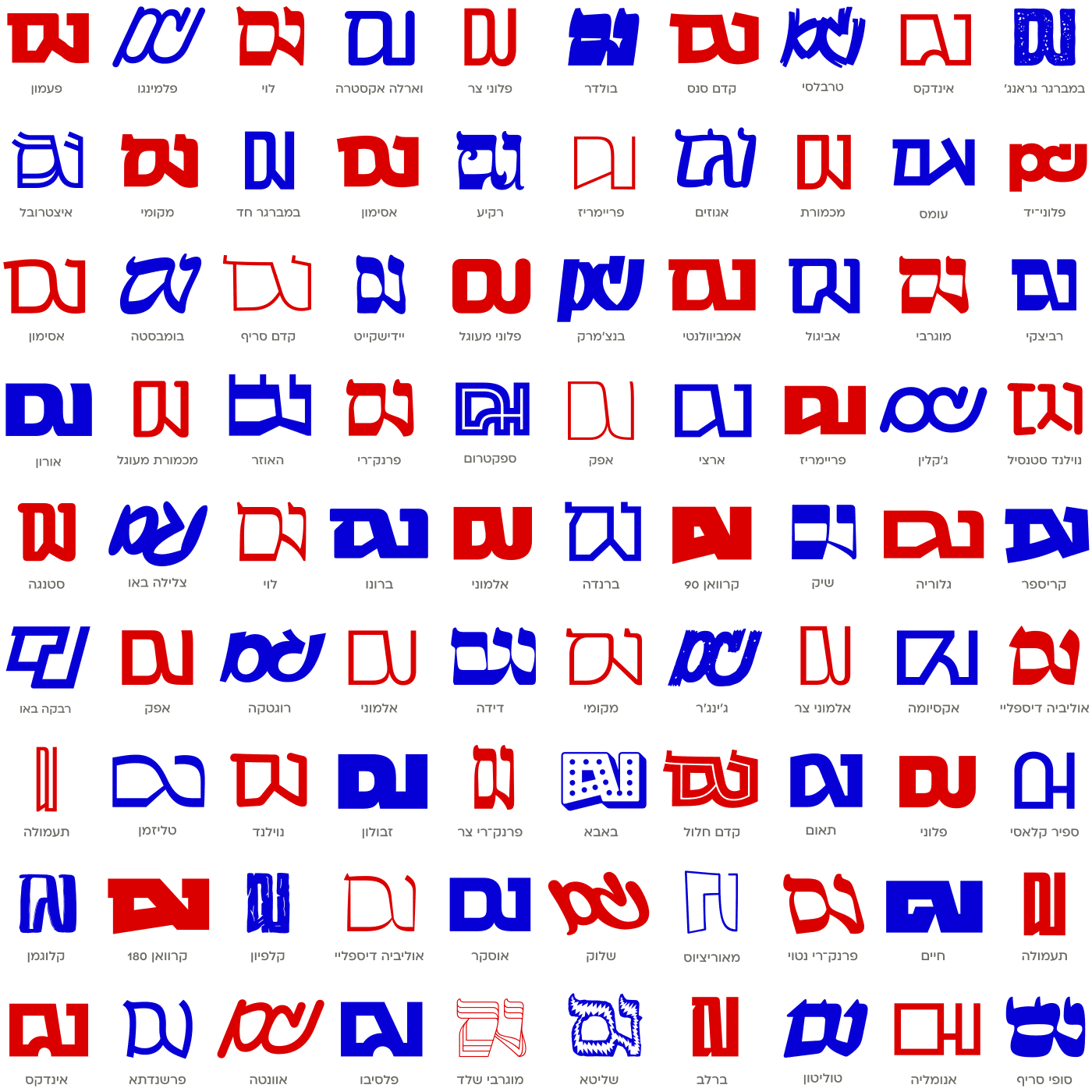
Seventy years ago, Ismar David laid the foundation for a Hebrew version of this concept when he designed an “et” symbol for the italic David typeface (as seen above). A decade ago, I decided to take the idea a step further and create a new typographic symbol – the “VeGam” sign. Since then, it has become an integral part of every typeface we design here at AlefAlefAlef and in Fontimonim – a hidden ligature crafted to match the unique style of each typeface.
The inspiration was simple and direct: just as the ampersand emerged from the visual merging of the letters et, the new symbol was built from a visual merging of the word “וגם” (Vegam) – meaning “also”. I knew it wouldn’t be adopted immediately, but I hoped – and still hope – that over time, designers will begin to appreciate its potential.
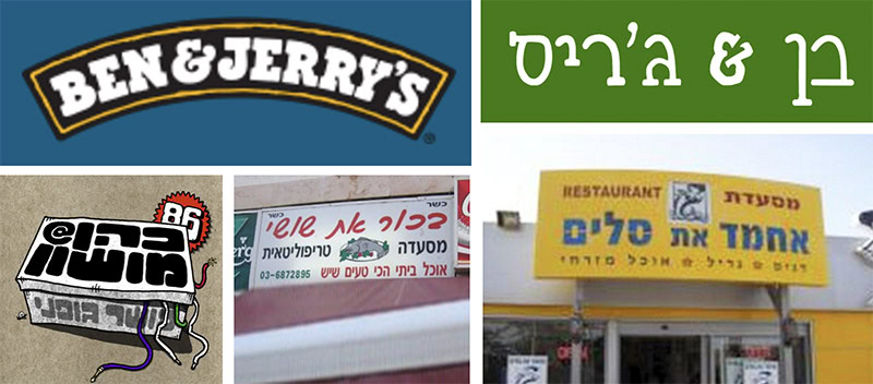
Partnership names, expressions like “Ben & Jerry’s” or “pretty and clever”, could look entirely different in Hebrew with one simple, elegant symbol instead of the regular conjunction ו. Such a symbol not only saves space, but also adds a distinct Hebrew typographic touch to any text.
So here is a challenge: next time you design a partnership logo in Hebew, a shop sign, a wedding invitation or anything similar, try incorporating the “VeGam” sign. It may be new and unfamiliar, but every change begins with a small step. Who knows – perhaps one day, like the ampersand, it will become an inseparable part of the Hebrew language.
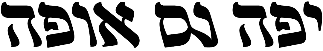
Here are several variations of the ‘Vegam’ symbol as it appears in our different fonts: