Trends are one social phenomenon whose origins can be difficult to trace. We always find ourselves wondering – who started the trend and how did it develop into the trend we see? And while trends in other fields can change and disappear just as quickly as they first appeared, typographic trends tend to embrace nods to iconic fonts, and popular patterns undergo incremental change. Just in time for the New Year, we set out in search of the typographic trends in Hebrew graphic design that should be on your radar in 2023. Some of them are new on the scene, while others are trends we’ve been seeing for years. We celebrate the arrival of innovative styles, while we bid farewell to others and make room for the next new thing.
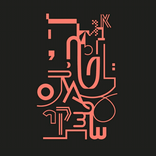
The Outsiders
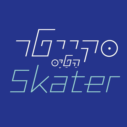
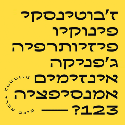
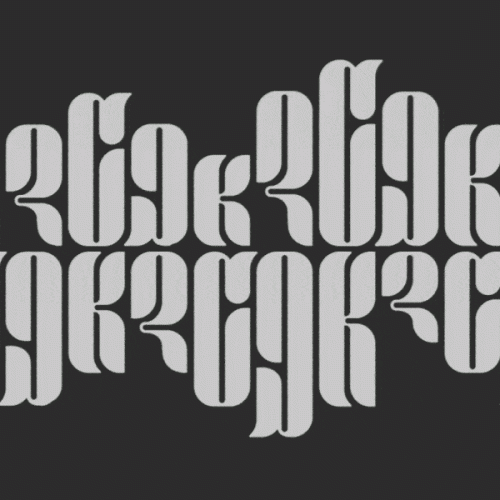
For font designers, the choice to create a “strange,” novel outline for letters is an experiment fraught with risk. If the letters are too strange, it’s liable to discourage designers from using it. Therefore, we tend to especially appreciate it when designers take the leap and release unconventional, striking fonts. The basis for most of these “outsider fonts” are geometric forms, straightforward yet bold. This lends to each of these fonts a graceful eccentricity, and an original look which charts new territory in the world of typography.
-

- פונט סקייטר בעיצוב הטייס
-
- פונט אנומליה. עיצוב מודעה: סטודיו דוד חליבה
-
- פונט נרקיס רותי. עיצוב רבייבל: פונטף
-
- עיצוב: עדן אופיר
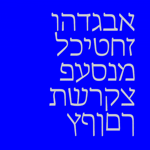
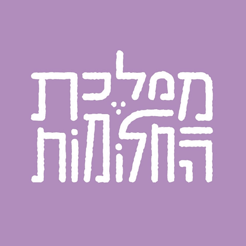
Hybrid Nikkud
Hebrew Nikkud (diacritic vowel marks) appear above, below, and within letters, and are used to indicate vowels or diacritics belonging to distinct letters. If Nikkud has generally been relegated to the margins of the languages which employ it, recent years have presented us with an increasing number of hybrid forms, which combine the Nikud of one language with the letters of another. The most common combinations in the Israeli arena are those which mix Latin letters and Hebrew Nikkud. Although voweled Latin spellings are most abundant, examples can be seen of Hebrew designs in which Nikkud are prominently displayed, and even hybridizations of Hebrew letters and Nikkud’s Arabic cognates Fatcha (ــَـ), Kasra (ــِـ), and Sukun (ــْـ) of Arabic.
-
- עיצוב: סטודיו דווקא
-
- עיצוב: ראם בן אבו
-
- עיצוב: Halo Design
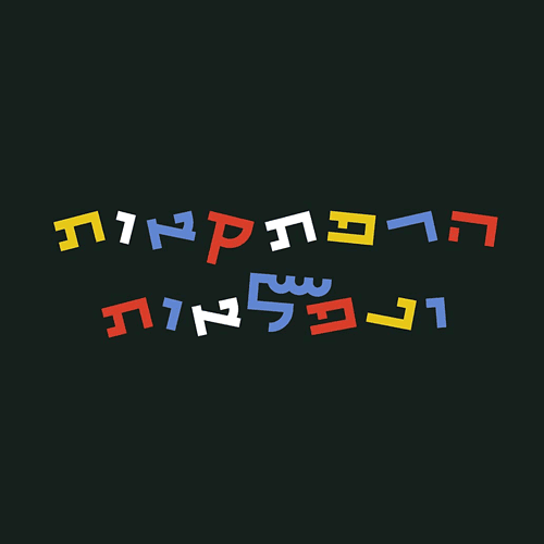
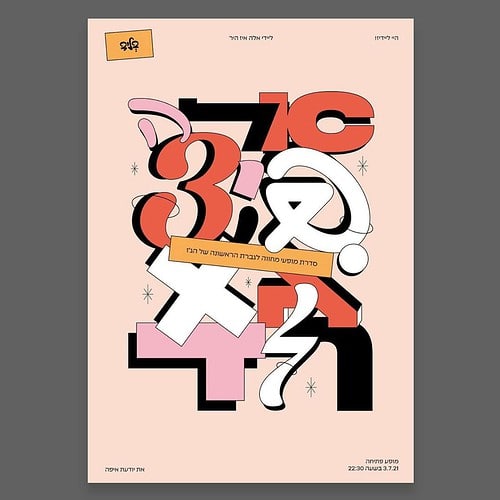
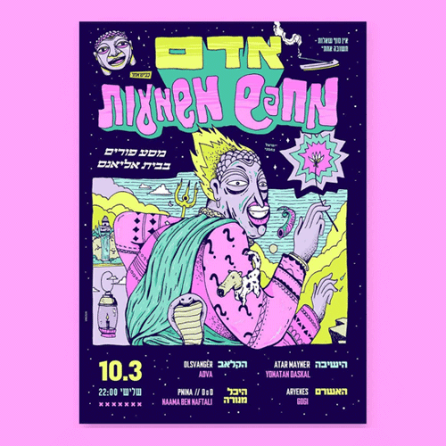
Letter Salad
One of the trends that’s been most exciting to see appear on the scene is a style which fuses together multiple fonts, weights, sizes, and colors. While this can quickly turn into a typographic and aesthetic catastrophe if done clumsily, when in the hands of careful and skillful designers, the result can look so sweet you could eat it for dessert!
-
- נעם רונאל
-
- טלי גלייטצר
-
- רינת הדר
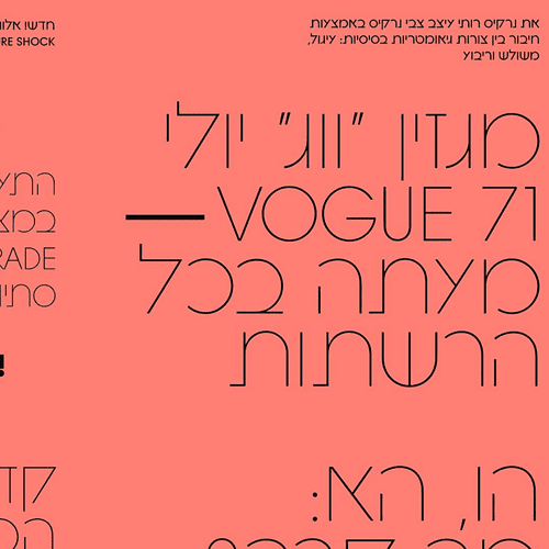
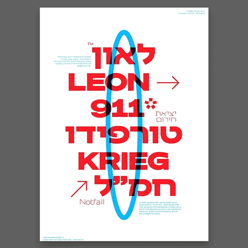
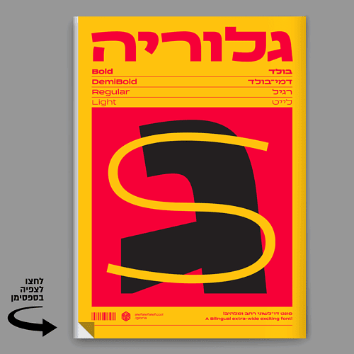
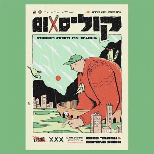
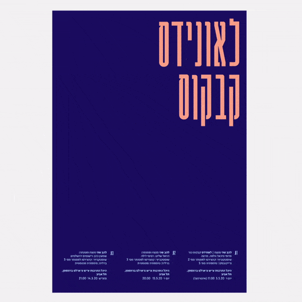
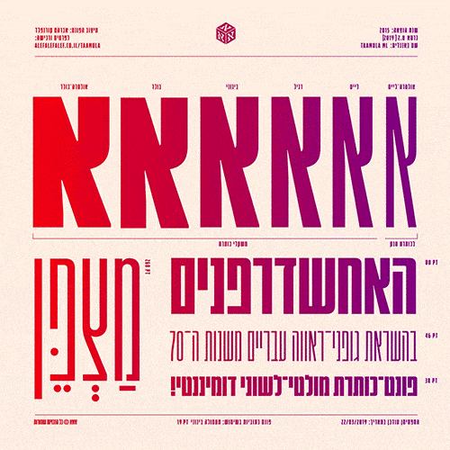
Wide Letters
What began years ago in Latin typography has now taken Israeli typography by storm. But what’s more surprising is that Hebrew letters make for a good fit with wide characters- who would have thought! Many of these wide fonts owe their influence to similar fonts with Latin characters, but others have a particularly Hebrew origin, drawing inspiration from nostalgic Israeli icons and posters. A unique combination of traditional-retro and current approaches makes for fonts which are at once nostalgic, fashionable, and uniquely exciting.
-
- פונט לאון בעיצוב בן נתן. עיצוב כרזה: ליעד שדמי
-
- פונט טליזמן בעיצוב שביט יעקב
-
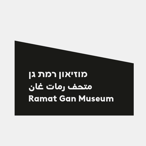
- פונט נרקיס בלוק רחב, בעיצוב צבי נרקיס, רבייבל: פונטף. עיצוב לוגו: Designit.
-
- פונט גלוריה בעיצוב אברהם קורנפלד
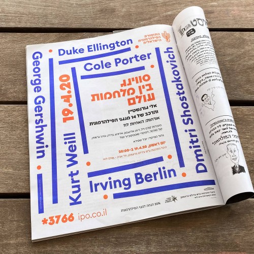
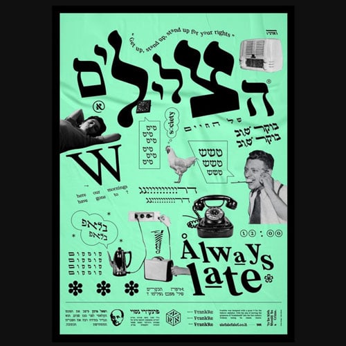
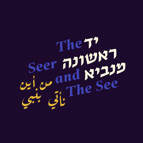
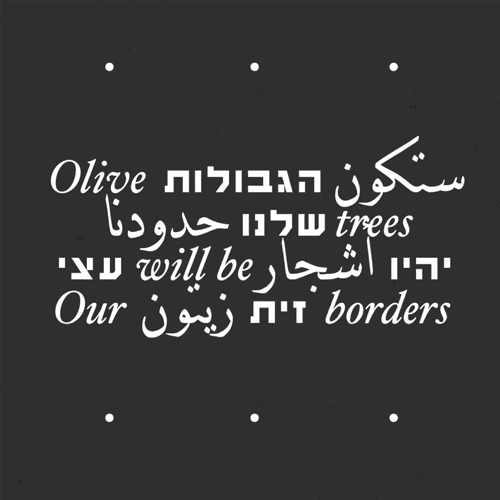
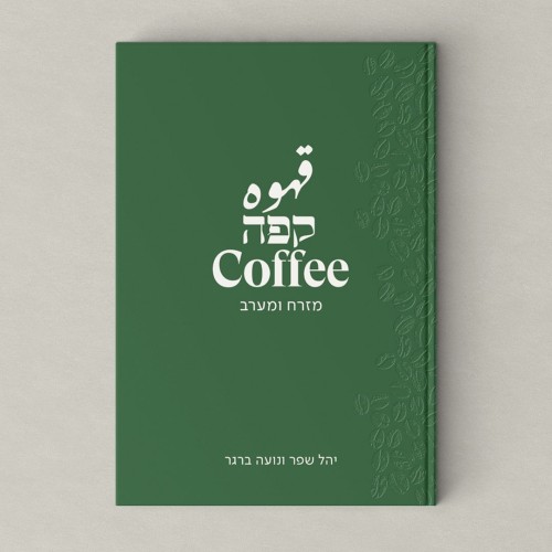
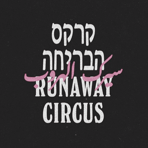
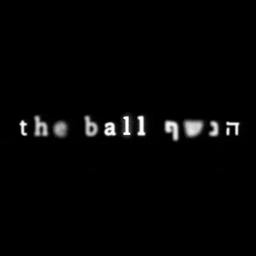
Trilingual Eclecticism
The term “eclecticism” generally refers to composite designs which make use of various styles. When speaking about eclecticism in relation to trilingual typography, it’s important to appreciate the complex relationships which connect Hebrew, English, and Arabic. Social sensibilities have evolved in recent years, and a consciousness towards bringing together the three languages (but often two) has risen considerably. When approaching this coupling of languages, designers must face the challenge of how to set letters next to one another without any one language overshadowing the other (so that all three share the spotlight equally).
-
- עיצוב: רה־לבנט ושביט יעקב
-
- לוגו בעיצוב סטודיו שיפט
-
- עיצוב: רותם סואיה
-
- עיצוב: דר לאור
Variable Fonts
Complete fonts generally consist of variable weights and thicknesses for the stroke of letter’s lines. For example: light, regular, bold, etc. In recent years, new technology has appeared which allows for a single program to include all possible weights and widths. This allows the user to choose any thickness they might want, available through an adjustable scale. These ‘variable fonts’ occasionally include other functions which can be adjusted through the use of a scale, such as a letter’s width, height, and serif size. Granted, this technology is still in its infancy, and the support of mainstream graphic programs leaves much to be desired (particularly for Hebrew fonts). But its prevalence is only rising – many font designers already have experience in this exciting new format. Can we expect variable fonts to replace today’s ubiquitous “heavy fonts”? Maybe, or maybe not- we’ll have to wait and see.
-
- פונט פטיש של הפונטיה. עיצוב כרזה: איתי בלאיש
-
- פונט קרוואן פרמטרי. עיצוב: אברהם קורנפלד ו־Yambo
-
- פונט פיבונאצ׳י פרמטרי בעיצוב שיר נידם
-
- פונט ביניים בעיצוב אורי הראל
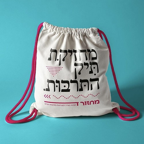
Gender-Inclusive Language
If for every trend of the moment there are properties which make it diffuse into the cultural ether, then multi-gender typography is a kind of force of nature. The concept made its debut years ago and has since refused to disappear- and to tell the truth, we’re here for it. Hebrew is a language bound to gender, and as such it’s become an arena for the cultural battles around gendered stereotypes which influence our behaviors and thoughts. At a moment when the boundaries of gendered expression are blurred, it calls for flexibility (and fluidity) in conversations around gender- and for language itself to reflect this cultural change as well. There’s something sweetly subversive about reading text written in female grammar – but the big issue remains the constructs of language which are built upon gendered forms. Here’s to a more progressive future.
-
- תיק לתכנית מנדל למנהיגות בתרבות יהודית. עיצוב: סטודיו דוב אברמסון
-
- עברית רב־מגדרית. עיצוב: מיכל שומר
-
- לוגו התאחדות הסטודנטים והסטודנטיות הארצית
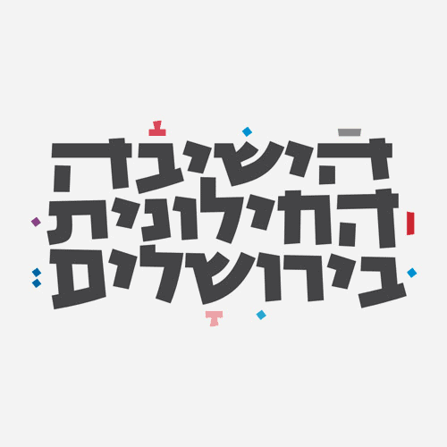
Return of the Serif
Digitization has made the serif all but disappear from our lives. Low screen resolutions made it difficult to render fine details such as the serif, leaving them out on them as negligible oddments. So began the slow demise of the serif, and the rise of sans-serif fonts. They’re simple, sleek, and have a refined character– all that was needed for them to become the go-to (and occasionally overkill) font for print and web designers. But technology has advanced leaps and bounds since the days of dial up and LCD display, and screen resolutions have risen in tandem. Practical excuses to exclude serifs are shrinking. Perhaps this might help explain the growing number of designers stepping up to restore the serif to its rightful place. That’s not to say that sans serif fonts are going anywhere any time soon. We’re seeing more and more fusions of serif and sans-serif fonts on the market– and if you ask us, it’s brilliant, and only demonstrates the beauty and richness of eclectic design.
-
- אתר מוזיאון ת״א לאמנות בפונט גרטה של מיכל סער. עיצוב: מיכל סהר וביקון אופנהיים
-
- פונט דיסקורדיה בעיצוב בן נתן
-
- עיצוב: יואב פרי ודן עוזרי
-
- עיצוב קשת כהן, עם פונט דוד ליברה (רבייבל: מאיר סדן)
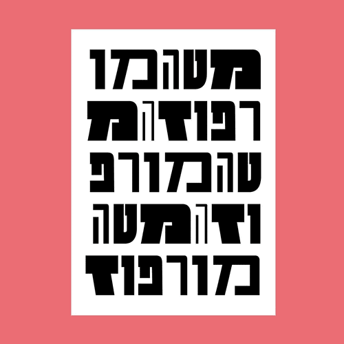
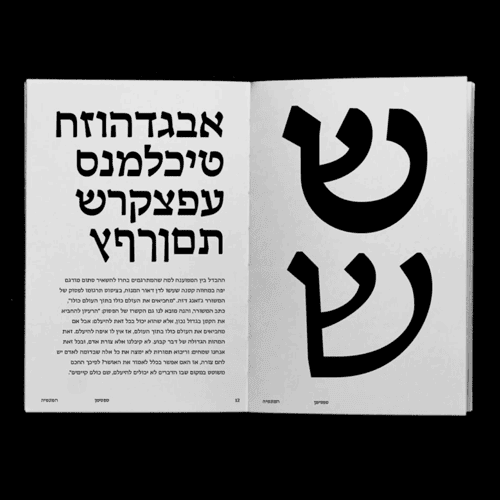
Rounded Geometric Fonts
The past few years have seen the rise of a new class of geometric, sans-serif fonts. Designers love to use them for a variety of projects, and praise their ease of use, neutral compatibility, and cosmopolitan, current feel. If in the past designers only had Narkis Tam at their disposal, today one can find a variety of fonts of this kind, the most popular amongst them being Ploni, Simpler Simonah, and more.
-
- עיצוב: נומה בר. פונט בשימוש: פלוני
-
- עיצוב: Open וינק יונטף
-
- עיצוב: קובי לוי
-
- עיצוב: פירמה. פונט בשימוש: סימפלר, מכיל סהר
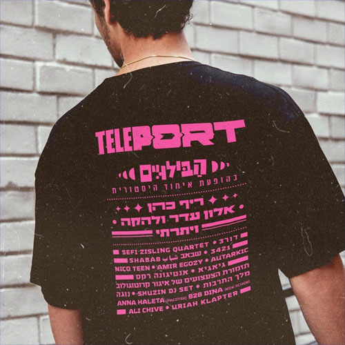
Grunge
Grunge movements stem from a cultural tendency to demand an alternative counterculture, antagonistic to the sterile, polite present we live in. Its aim is to infuse design with a non-conformist, care-free strain, through tactility and “dirt.” Recently, there’s been a noticeable rise in the use of grunge fonts to market food, because grunge, as it turns out, stimulates an appetite. The letters of grunge fonts are “dirty” and intentionally casual and inharmonious. Its coarseness, ironic pastiche of discordant motifs, and anti-aesthetic aesthetic lend to an altogether self-assured design.
-
- עיצוב: טל פוגל
-
- עיצוב: דר לאור
-
- עיצוב: ארז שמח
-
- עיצוב: עומרי אברהם
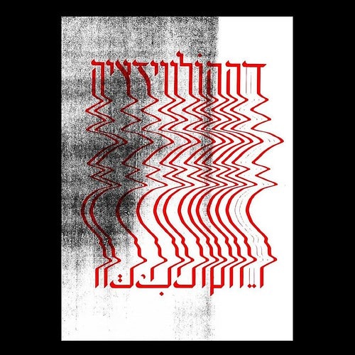
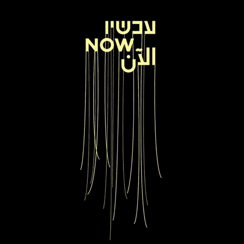
Letters in Motion
Technology in recent years has allowed animation to reach areas previously thought to be inaccessible. Nowadays, designers who want to enliven a static design have kinetic typography, motion graphics, and 3d design at their disposal. It’s no wonder that designers the world over have applied this technology to create a carnival of typography come to life- at times even incorporating sound. This field is steadily growing, and enables designers to stretch the limits of what’s currently thought possible. While it tasks designers with producing a streamlined product out of a complex process, the results can be a true treat for the eyes.
-

- תדמית לפילהרמונית. עיצוב: Open
-
- עיצוב: עופרי גיל, Relevant
-
- עיצוב: איתי ויינשטוק
-
- עיצוב: Dase Boogie
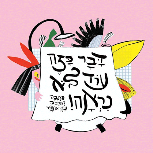
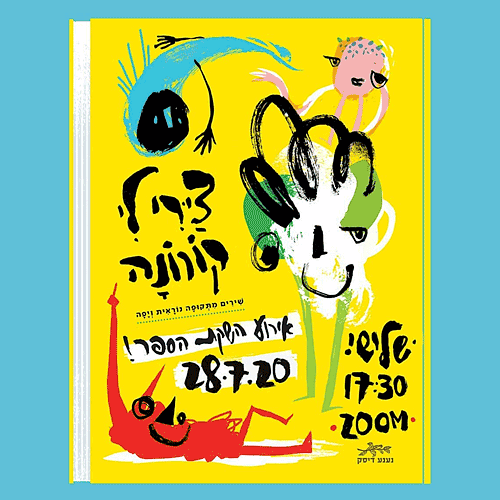
Hand-Illustrated Letters
In recent years, the field of hand-drawn typography and illustration has experienced a revival of sorts. A number of illustrators have chosen to take the risk and hand-design the letters that grace their designs. Some of these hand-crafted letters are imbued with a skeek roundness and a precise balance, while others are characterized by a casualness which yields a design of utmost authenticity. However they’re carried out, hand drawn letters are generally closer to lettering work than a typeface per se, and their styles can’t be said to represent strictly Hebrew spelling influences. But, as with any manual technique, hand-drawn fonts will lend to your design a current and original energy.
-
- עדן אופיר
-
- דקל חברוני
-
- ארז שמח
-
- עיצוב: ברוך נאה וענת ורשבסקי
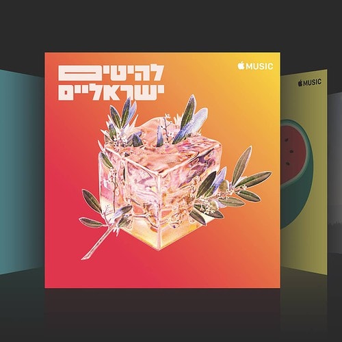
Expressive Typography
Let’s settle the debate – a “good design” is one that can catch the eye, create a connection, and convey a message. The most spellbinding typographic designs place a premium on the aesthetics and power of the written word. The goal is to leave the viewer in awe. When a design can convey emotion as well as beauty – so much so that it’s difficult to remain indifferent – that’s the mark of creative triumph. The ability to create a successful, expressive image through the use of typography is reserved for an outstanding few, who aren’t afraid to break free of the everyday and let their imagination run wild.
-
- עיצוב: סטודיו מיכל מרחב. (פונט: שלוק)
-
- עיצוב: עומרי גולדזק (עבור לה־קולטור)
-
- עיצוב: קובי לוי
-
- עיצוב: חן מכבי
Translated by Jacob Rivkin.