Type revival is a design methodology built on studying and adapting historical typographic works. The motivation behind reviving a typeface may point to its popularity in its own time – but I would argue it says even more about the moment in which someone decides to revive it.
Like every field of art and design, typography too has fashions that come and go. But unlike other creative fields, typefaces have a very specific function: they must serve a user.
So when a style returns to relevance and a typeface can become useful again, a technical issue arises – a technological gap between fonts originally created for letterpress printing or Linotype machines and the digital formats of recent decades, which require vector-based designs.
Simply put: type revival is the process of making an old design accessible to today’s technologies. With that pragmatic mindset, I approached “Oron.”
Asher Oron. Photo: Eran Ben-Barak
Typographer Asher Oron studied at the London School of Printing, known today as the London College of Communication, where he specialized in typesetting and typographic work.
During his studies he connected with other Israelis living and working in London at the time:
“In London we would switch back and forth between Hebrew and English. I wanted to create the possibility of designing in both languages. Today it’s commonplace, but back then matching fonts between languages was a real need.”
That was the moment he decided to design a typeface meant to serve as the Hebrew counterpart to Adrian Frutiger’s Univers.
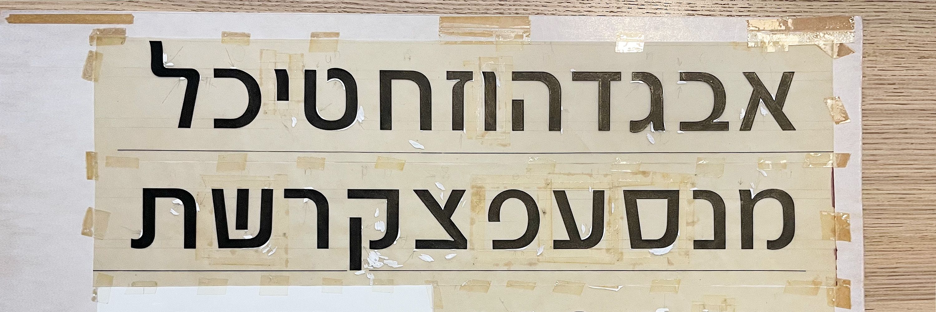
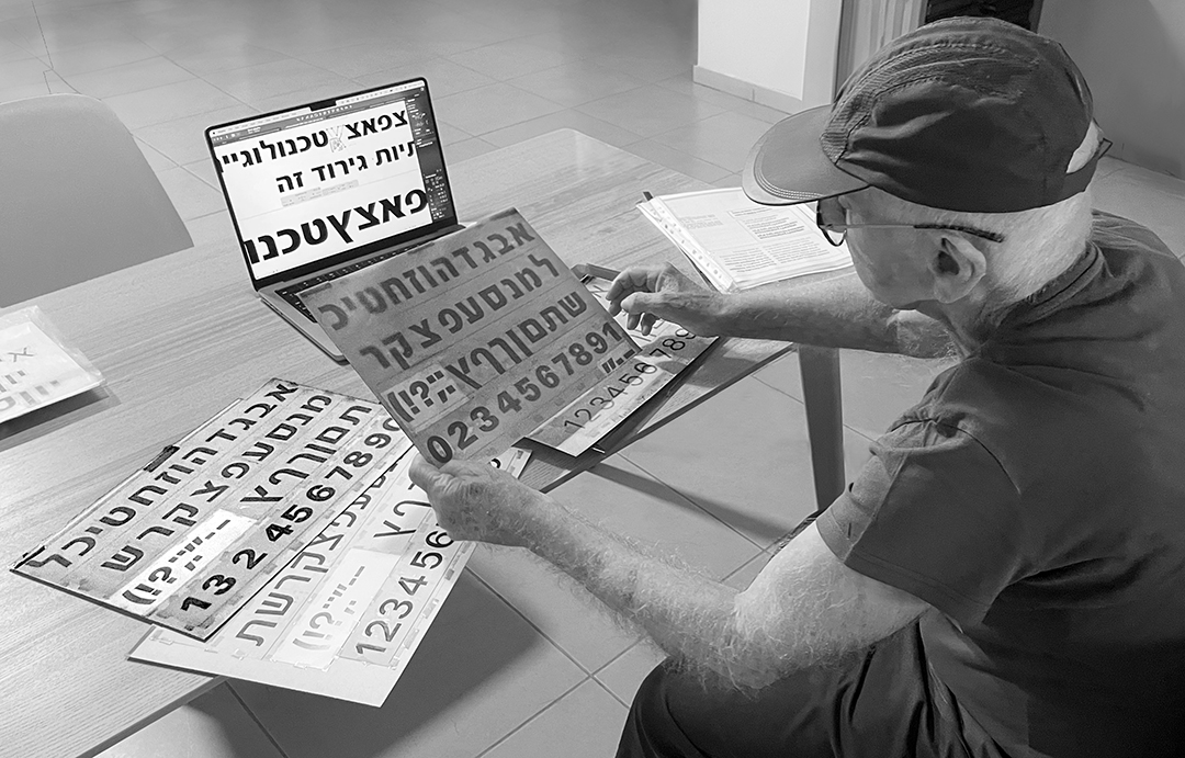
As I dove deeper into the project, I discovered that Oron was originally designed in 1966 for Letratset (rub-down transfer letters), and that’s what drew me in as a type designer.
When designing for Letratset, the considerations differ from most technologies that came before or after. In short, the key difference is that transfer letters stand entirely on their own, without the built-in spacing rectangles used in metal type, handwriting systems or digital fonts. The spacing is left completely to the graphic designer.
As with any design method, the advantages come with drawbacks: on one hand, each letter can be designed freely; on the other hand, the result gives up some control. That is why, in a typeface like Oron, the letters must be more “universal” to ensure they work in all spacing contexts.
When I began the project, I tried to understand the core strengths of the design and what gives Oron its personality. I noticed that working on the font reminded me of designing Latin typefaces: the letterforms are built around a basic principle of reusing shapes.
Today, on computers, copy-and-paste makes this effortless, but historically there was a technique even in metal type called counterpunching, which enabled designers to reuse interior spaces (counters). This principle creates rhythm and harmony in text. All typefaces reuse forms to some degree today, but in Oron it is especially pronounced in how the letters are grouped.
In Latin typography, most of the font is built from families of shapes centered around the letters “n” or “o.” Designing these two letters essentially defines half the typeface. And indeed, in my conversation with Asher Oron, he expressed this same approach:
“Most of the letters are simple: lines and circles.”
During my research I discovered that the DNA of the typeface lies particularly in the letters hey and samekh. Beyond that, there is something mechanical and precise in Oron’s original work that gives the typeface its unique character. For example, even the letter kuf fits into the same structural group as samekh.
There will be much to say about Oron and its design process, but I wanted to pause at this moment in time – this chapter of the typeface’s revival – and mark another milestone in its life. There is something about reexamining historical designs that gives us, as modern designers, deeper understanding and tools that previous generations did not have.
I am excited to take part in bringing the typeface into a new era, and I am confident that Asher Oron would be pleased with the outcome. Now the typeface is in your hands, and we look forward to seeing the wonders you’ll create with it.
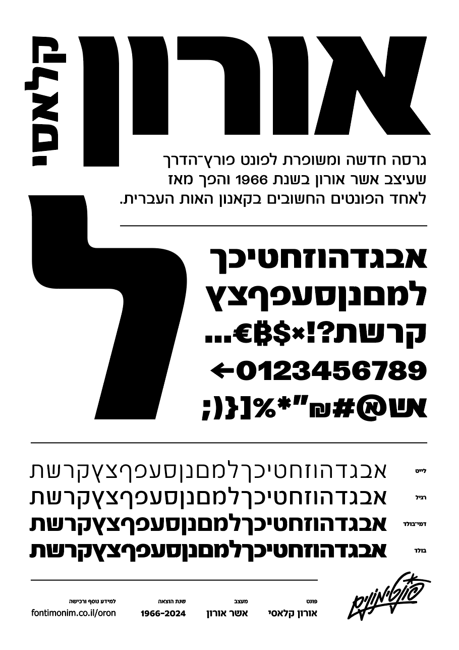
The renewed Oron Classic typeface – now in the Fontimonim catalog.
Design: Asher Oron. Revival: Eran Ben-Barak
Oron in Action:

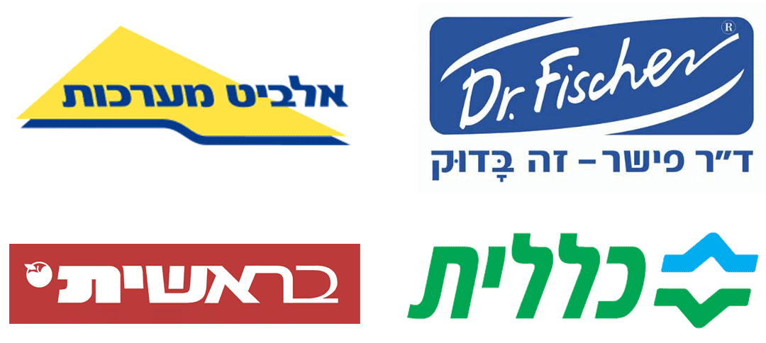
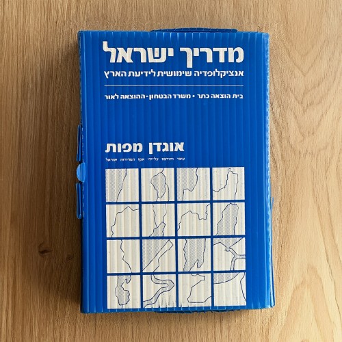
Photo: Eitan Zellver