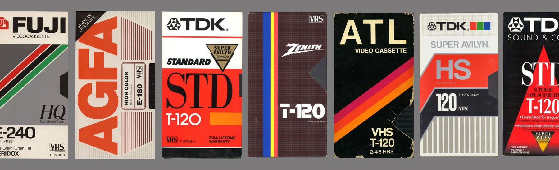
For a while now, the thought of designing something in the style of 80s and 90s VHS covers has been running through my mind. I can’t quite put my finger on it, but I always found their aesthetic very cool. You know what I’m talking about, right? The video cassette covers of TDK, SONY, JVC and the like. I recently found two more VHS tapes thrown in the street and wasn’t sure what to do with them. Perhaps inspired by Israel’s 70th anniversary celebrations, I suddenly realized that I should connect it all to something new.
So I sat down and designed some banners in homage to Israeli movie classics – from the founding of the country to this day. During this process, I focused on films that I had seen, both because of my personal affinity, of course, but also to understand the aesthetic and style that emerge from the plot and the art. Another factor that influenced my choice of films was the thought that I could extract from these films certain graphic elements that resemble the typographic style of VHS covers.
The inspiration
I explored the aesthetics of the original covers, their color balance, their graphic elements, and their repetitive fonts. I mostly used familiar fonts such as “Haim” and “Haim Narrow”, mainly because I needed a font that has simple lines and lends a certain historical credibility. Occasionally, I’d use fonts such as “Liebling” by Yanek Yontef and other fonts like “Amar” and “Prat”, which were widely used in graphic design during the 80’s in Israel.
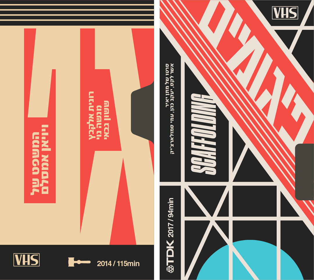
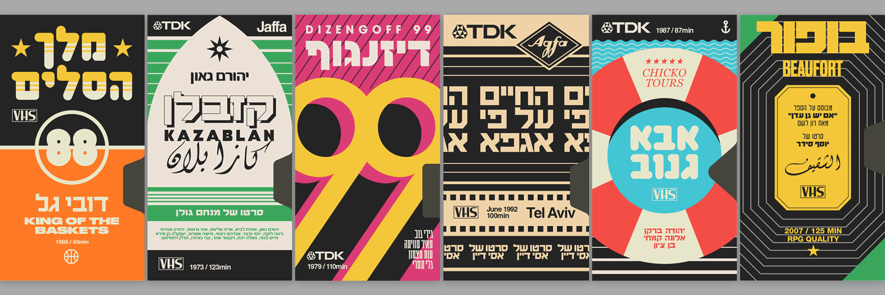
In most cases, I tried to preserve the original covers’ graphic style of lines of varying thickness. I also used a grid that’s graphically identifiable with a particular video brand, although I sometimes I tried to break away from it for the sake of the concept, by creating a large object that redefines the poster’s grid and the typographic arrangement, as you can see in the banners of “The Skipper”, “Days of Love” and “A Bit of Luck” (Names of Israeli movies). Bear in mind that in order to bolster the sense of stylistic credibility, I had to create and add secondary details such as the actors’ names, small icons, the movie’s release year and running time. Finally, I added the logos of the video brands – SONY, TDK, etc., to provide the final seal of credibility.
In general, you could say that with each banner I tried to find the right visual world to inform the cover’s design, but without straying too far from the film’s content and general atmosphere. You can find specific and clear examples of this process in the “Basket King” banner which is divided into a relatively simple basketball court grid; “Operation Thunderbolt” in the colors of the Ugandan flag; “Lebanon” in the colors of the Lebanese flag and the eye inside the sight, since the entire film is shot through the gunner’s periscope. “Kazablan“, for example, draws some inspiration from the old “Elite Arak” label; “Life According to Agfa” draws inspiration from the world of film and photography, as does “Photo Farag” with the aperture element.
Where this project goes from here is hard to say. But I hope that the graphic tributes I designed do justice to Israeli cinema and the sense of nostalgia that these old films invoke in all of us.