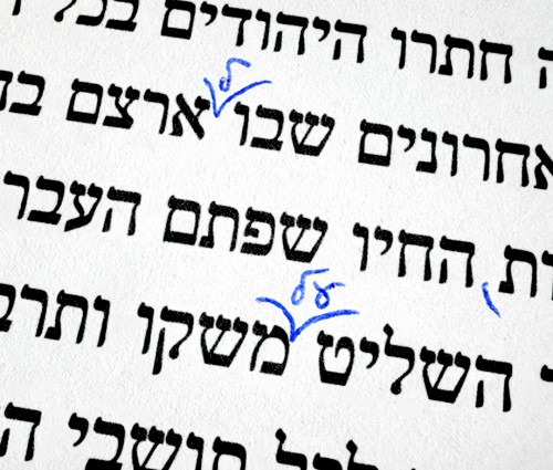
Unlike other Hebrew symbols, this one doesn’t need a dedicated key on your keyboard, since it’s meant for handwritten editing. We all use it – whether editing a shopping list or writing a love letter – but it’s especially useful in copyediting and proofreading. In those contexts, it marks the exact point where additional text should be inserted: a word, a letter, or even punctuation.
The Academy of the Hebrew Language has not assigned an official name to the sign, but it is commonly known by several nicknames: “bird,” “wings,” “V,” and others. Two years ago, the Academy even posted a call for suggestions, and some creative proposals emerged: tosfan (add-on), ma’af (a flying dash), and even the humorous suggestion “Frida Kahlo”.
In English, a similar symbol is called the caret, which is used in proofreading to mark a spot where a word, punctuation mark, letter, or phrase should be inserted. The term derives from the Latin word caret, meaning “is missing.” Because of this, the English-Hebrew dictionary by Reuben Alcalay translated it as heser (“missing”) or “deletion mark.”
A few years ago, we at AlefAlefAlef began designing this symbol into some of our fonts – mainly our cursive ones. Elad, our editor, suggested the idea, and if there’s a character we can design, you can bet we’ll design it. At first we called it the “Yana mark” after Elad (Yana being his lastname), but eventually we realized it basically looks like a bird – so today we simply call it “the bird mark.”
At least until the Academy decides to give it an official name.
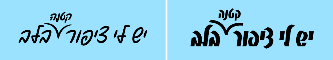
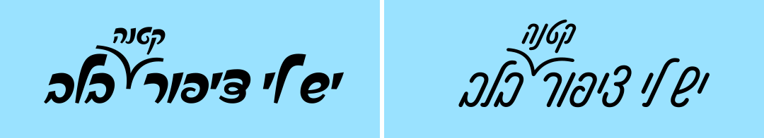
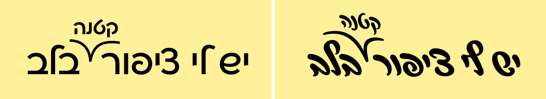
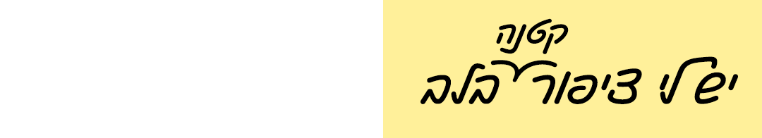
It’s a Bird, It’s a Plane…
Since there is no Unicode character for this sign, we decided to temporarily assign it to the inverted nun character – which is simply the letter nun mirrored horizontally. This symbol appears in nine places in the Hebrew Bible, marking verses that are “out of place.” It was a common scribal notation in antiquity. As a fun piece of trivia – the inverted nun originated from the Greek anti-sigma, which later evolved into the modern parenthesis symbols.
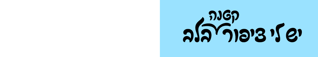
Since the inverted nun has an official Unicode slot and has no real use today (other than biblical typesetting), we decided to place our bird mark there. In any case, this sign is relevant only to cursive-style fonts (handwriting fonts).
As of today, eight of our fonts include bird glyphs. Some even have multiple variations to better fit their position before or after tall letters like Lamed (ל). Feel free to adjust the sign manually so it fits neatly between the words and under the intended insertion point. And if you create something beautiful or interesting with it – please share it with us. We’d love to see and be proud.
The Birds in the AlefAlefAlef Catalog:
The Birds in the Fontimonim Catalog:
- Benchmark – version 1.1+
- Tslila–Bau – version 2.0+
- Flamingo – version 2.0.1+
- Rugatka – version 1.0+
- Shpagat – version 1.0+