Logotypes of major contemporary brands tend to showcase a highly polished, meticulously crafted look, defined by clean and direct lines that often converge into simple geometric shapes. This clarity is reflected both in the symbol and in the typography. Sans serif typefaces, free of decorative elements, project simplicity, precision and innovation, and are now almost always preferred over serifed typefaces, which can evoke an old fashioned or less progressive tone. A clear example of this preference is the Google logo, which abandoned its serifed letters in favor of letterforms based on simple geometric shapes.
“The ornamentation, the ‘spikes,’ the serifs, the color play and textures are what create the visual interest.”
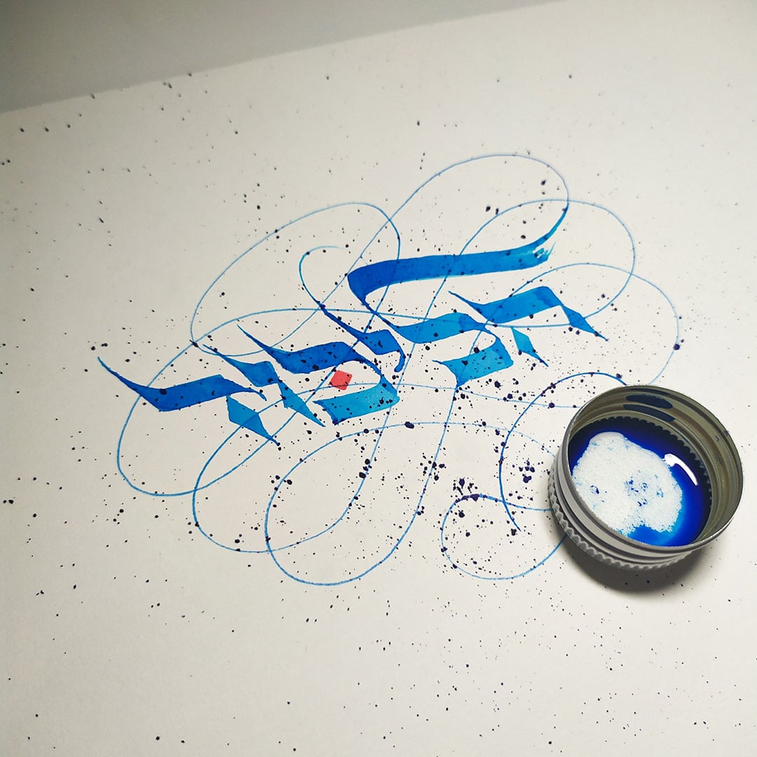
Calligraphy, or more precisely modern calligraphy, is far less bound to the values of minimalism. If the worlds of branding and design celebrate the mantra Less is More, calligraphy leans toward More is More, or even Less is Bore. The ornamentation, the ‘spikes,’ the serifs, the interplay of colors and textures are what make it engaging. I was curious to explore how these two realms, typography and calligraphy, might intersect. I wanted to see if a kind of inversion could be applied to logo design, transforming a minimal, clean logotype into a richly ornamented emblem rooted in intricate, traditional writing styles, without losing its immediate recognizability.
The inspiration for this calligraphic study came in part from Luis Lili and Sara Marshall, who took well known global brand logos and gave them a calligraphic twist. I wanted to explore how a similar approach could be applied to Israeli logos written in Hebrew, and what might emerge from blending the formal restraint of corporate design with the expressive freedom of calligraphy. In other words: toss Hebrew letters, vector lines and ink into a blender, and hope for the best.
The first challenge was choosing suitable logos. I tried to focus on familiar logos with strong typographic presence, particularly those built from clean sans serif letterforms. To create a wide scope, I selected representative symbols from fields like communications, retail, politics and finance.
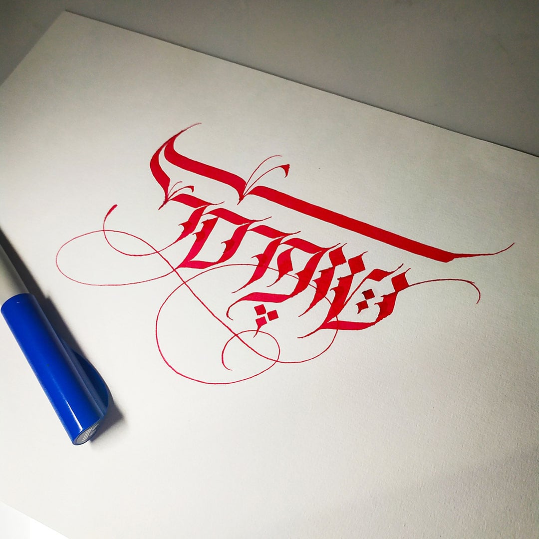
The first logo I chose to reinterpret was the Likud logo, without a doubt the most dominant and quoted logo in the Israeli political arena. Its influence on other party logos is visible in the heavy, clean typography, the tilted letterforms and the blue palette. Above all rises the iconic ל׳, waving like a flag, which has become a highly recognizable symbol.
“I chose to remain faithful to the original color palette of each logo to ensure easy recognition.”
The second challenge of the study was to define a calligraphic writing style that could correspond to the logo’s typographic style, functioning as a sort of decorative ‘costume’ while preserving instant recognition. For the calligraphic Likud logo, I chose a loose variation of Ashkenazi writing, rich in sharp serifs and strong stroke contrast, specifically as a counterpoint to the heavy sans serif letters of the original. In addition, I decided to remain faithful to the original color palette of each logo to allow for quick identification.
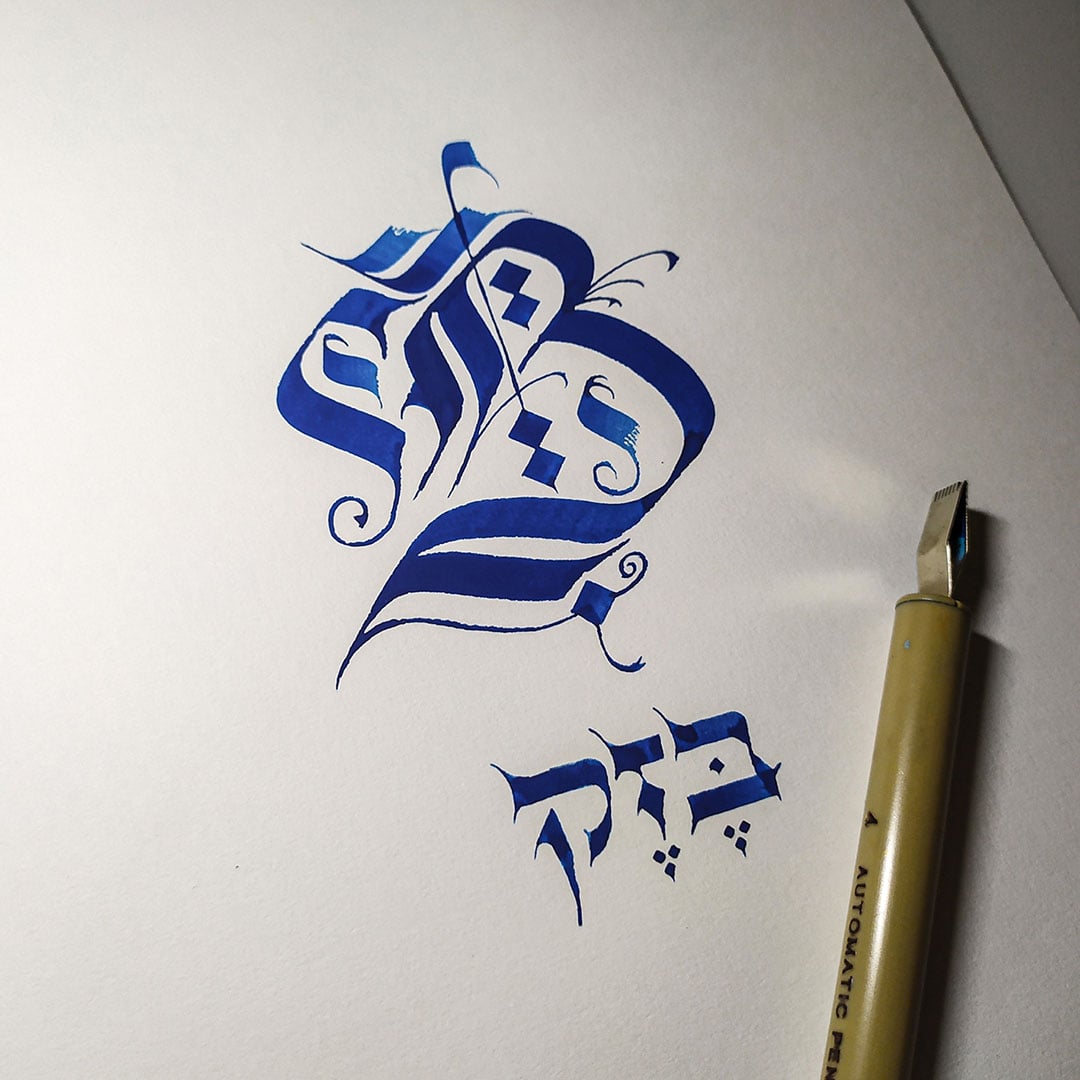
The third challenge was identifying each logo’s dominant, recognizable element and amplifying it using deliberately exaggerated calligraphic techniques. In the Bezeq logo, for example, I transformed the simple B of the original into a large, heavy, branching capital B in a Gothic (Blackletter) style. In the Likud logo, the flaglike top of the ל׳ extends into swirling flourishes. The red dot in the כ׳ becomes an ornamental accent, while still hinting at familiar election-campaign visual cues.
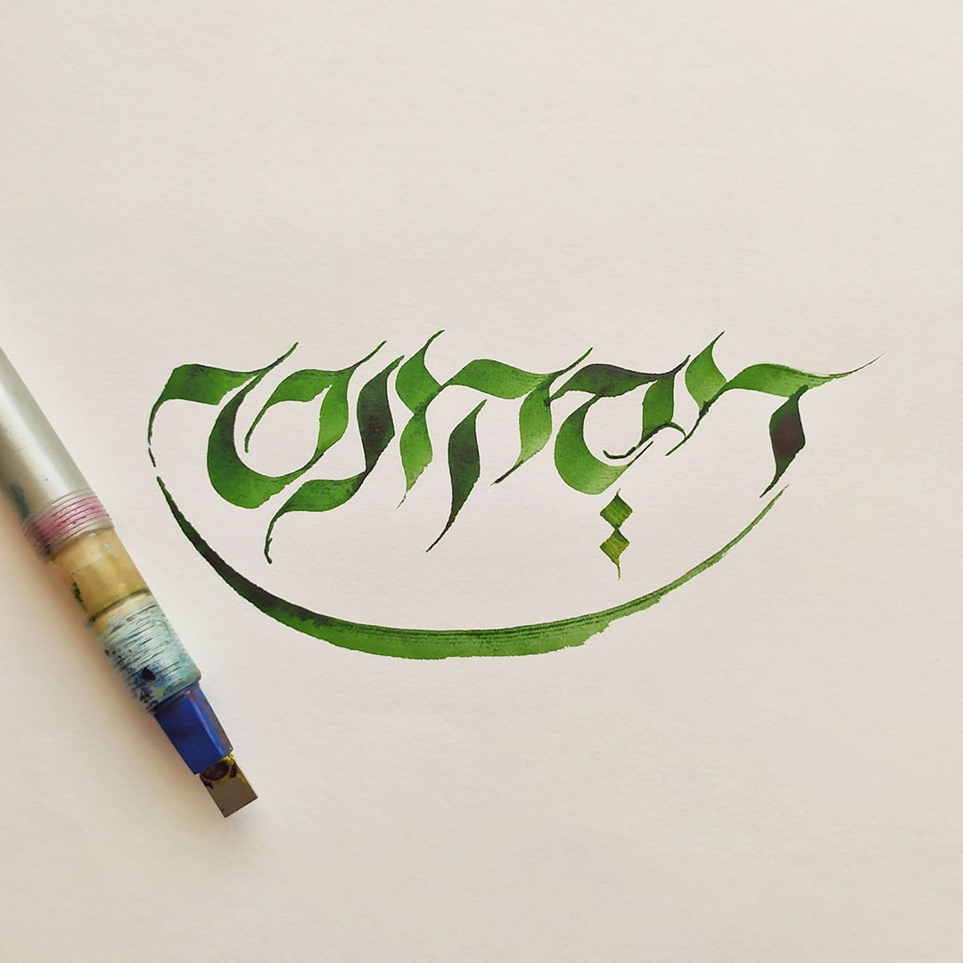
In contrast, in the calligraphic Discount Bank logo, the elements that sustain recognition are the green color and the curved smile. Without them, it would be difficult to identify the logo, simply because of the considerable gap between the original Culya typeface and the slightly flamboyant calligraphic style I chose. The same applies to the Shufersal logo, where I preserved the upper horizontal bar, the key visual element of the original.
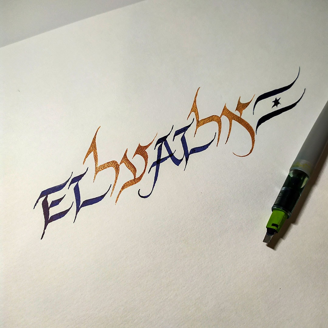
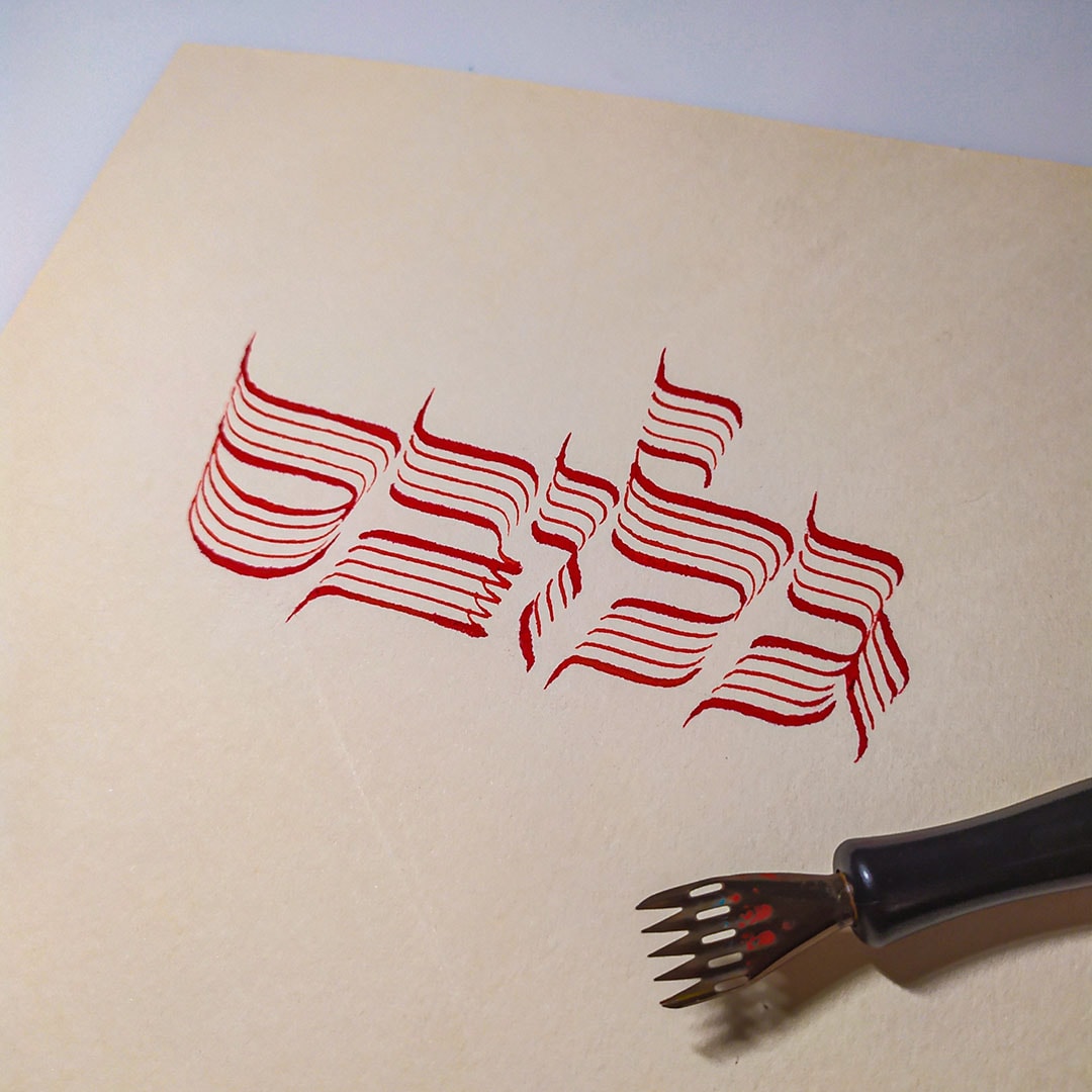
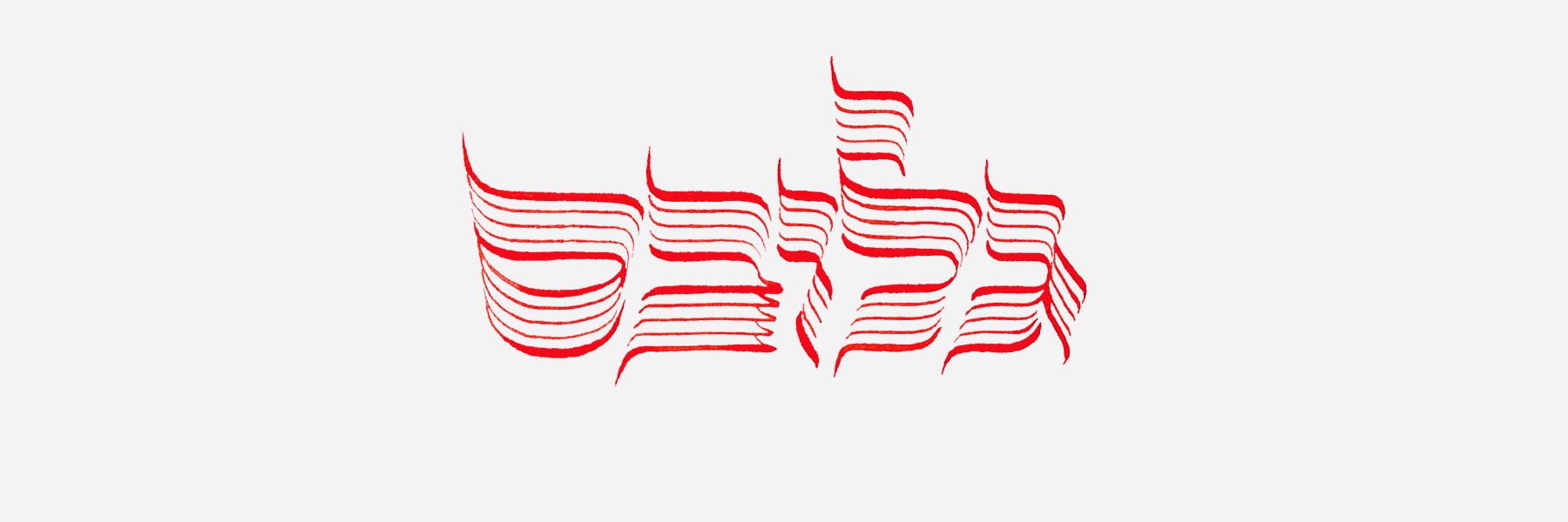
For the El Al logo, the challenge was to find two writing styles, Hebrew and English, that would complement each other and share a foundation with the right-leaning slanted letters of the original. In the Globes logo, I tried to reinterpret the segmented letterforms as calligraphic letters composed of parallel strokes made with a split nib usually reserved for drawing musical staff lines.
I have yet to draw sweeping conclusions from this small laboratory, and I am not sure there is any need to. One could certainly apply this exploration to additional logos or to other design applications. One could even think of this playful experiment as an unexpected encounter with a buttoned-up colleague or client at a Purim party. And perhaps, at the end of the day, on a personal level, you do not need many excuses to embark on a fun project. All you need is a nib, ink and paper, and the willingness to let the line lead the way.