by Emily Theodore
Elsa always felt a connection to typography. “Both of my parents work in literature, and books have always been everywhere in my life,” she shares. After studying Graphic Design in Paris, she pursued a Masters in Type Design.
 Exploring Yiddish type during her Master’s was, Elsa admits, the less obvious route in a Latin-based environment. The initial interest stemmed from her own heritage: her mother’s Jewish family and the memories of foreign magazines in the house. “My great-grandmother was Polish and used to read Yiddish journals. My mom remembers her with an unreadable script – it was only when I started working on this project that my mother discovered it was Yiddish.” With some previous experience working with Greek and Cyrillic, Elsa approached Yiddish from a typographical perspective. “I don’t speak Hebrew, and I took some Yiddish classes to understand what I was drawing because I was only raised around Latin,” Elsa explains. “It was a challenge, but I enjoyed seeing the world differently.”
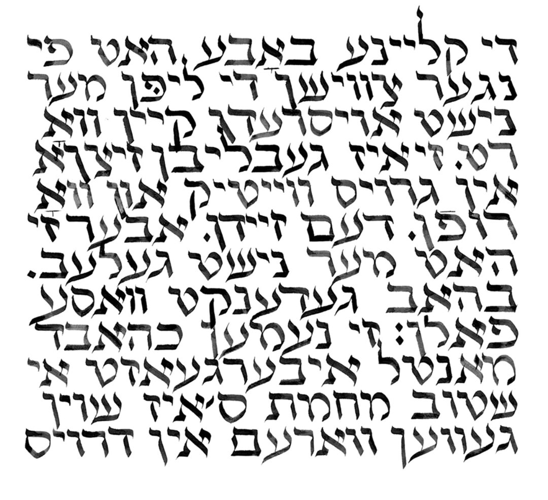
Because square calligraphy was reserved for Hebrew and religious texts, Yiddish from the 13th to 17th centuries was often written in vaybertaytsh – a semicursive script similar to the Rashi – for everyday, non-religious content. Written Yiddish transformed over the centuries, not to mention between communities. This meant many characteristics of the Yiddish type, from the shapes of letterforms to the use of nikkud, were never really standardized and relatively open to the interpretation of designers and print houses at the time.
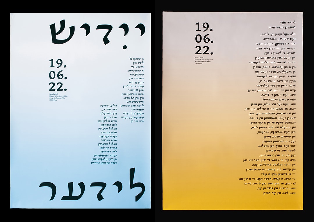
Elsa was approached to design what would become Yiddish Mono. It’s a typeface commissioned by Studio Remco van Bladel for Casa Do Povo, an archival centre in Brazil with an extensive collection of Yiddish books, photography, and artifacts. “Remco believed – and I totally agreed – that using the original script is important.” Elsa points out. “If you see an image of a book, you want to see the same writing above it.”
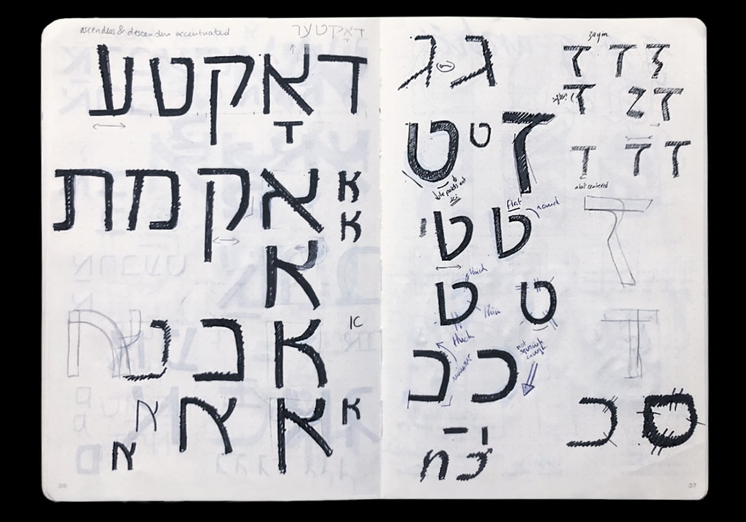
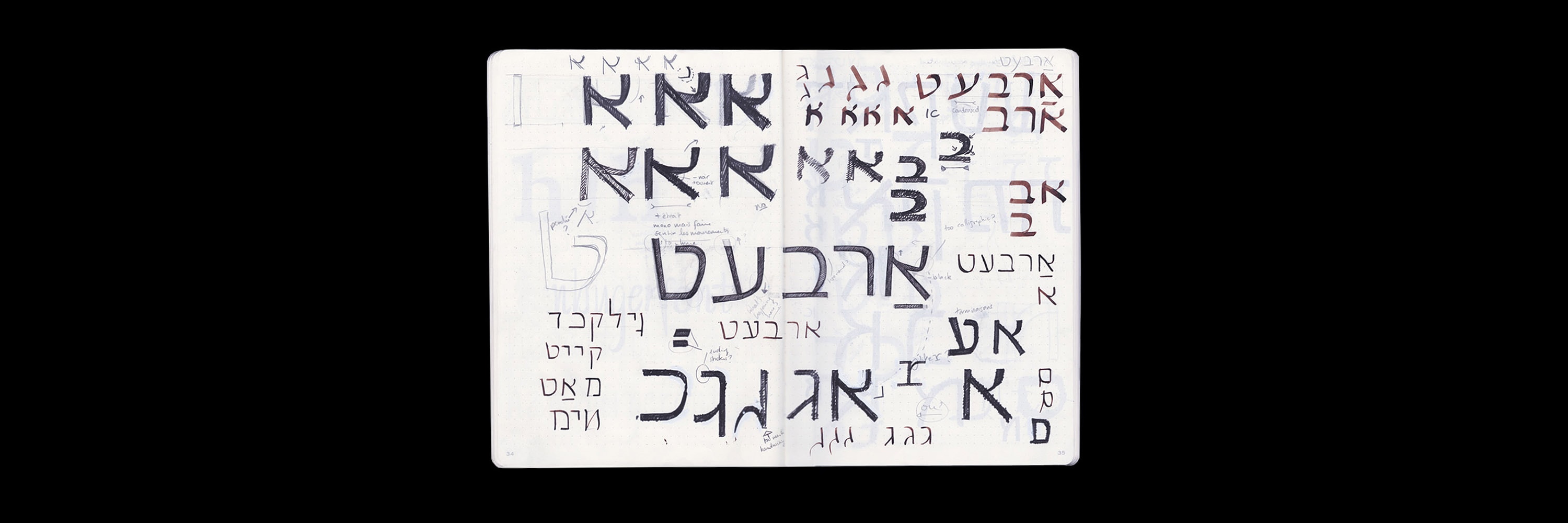
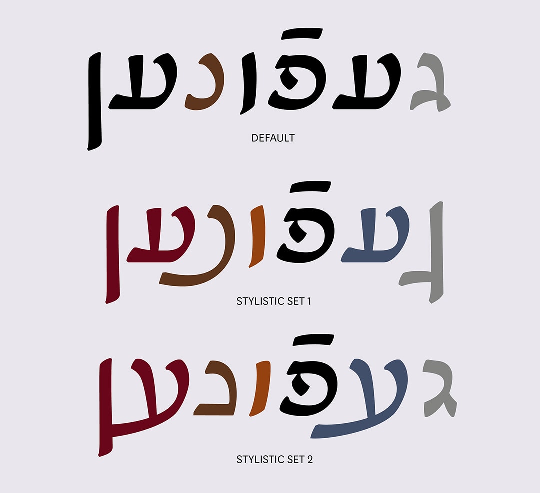
It was almost expected to explore a manuscript-inspired look for a Yiddish typeface initially – but how would this look within the contemporary identity of Casa Do Povo? “I got to a point where I had to decide on a different way to draw a Yiddish typeface,” she recalls. Referencing the usability of modern Hebrew typography, the brief evolved for Yiddish Mono to achieve a similar standard. She explains that Hebrew typefaces often lack specific glyphs and ligatures commonly found in Yiddish or don’t consider the spacing needed. For this reason, it needed to be treated as a script in its own right to feel relevant today. “For this project, I wanted it first to be usable. And I also wanted to keep some softness and details to reference Yiddish and vaybertaytsh – so no matter what it’s used for, you know it will work.”
The process of designing Yiddish Mono, Elsa describes, was anything but linear. “I spent a lot of time looking for documents and manuscripts,” she recalls, “and trying to understand the difference between Yiddish and Hebrew.” It involved visiting archives, arranging meetings, and organizing material on Yiddish throughout the centuries while referencing modern Hebrew at a distance. Experimenting with square calligraphy also helped Elsa understand the movement of Hebrew letters, although her familiarity with Latin script isn’t always easy to disconnect from fully. “That’s something I can’t get rid of,” she admits. “So it’s important to say here that this is my approach to Yiddish.”
So what makes a typeface Yiddish? “It depends on how it’s used,” was one answer she received. But designing Yiddish Mono revealed that many typographic features within Yiddish haven’t been considered in modern Hebrew. Compared to Latin, Cyrillic, and Arabic scripts which support multiple languages, it raised some valid points on Hebrew’s inclusivity. “It’s interesting to see what other languages are also covered by the Hebrew alphabet,” Elsa notes. “And there’s a possibility to see more shapes in Hebrew typography. It’s like opening another door.”
Yiddish today is spoken by around 1.5 million people, mainly across Israel, Europe, Russia, and the United States, and usually in more religious Ashkenazi Jewish communities. Yet historically, Yiddish script presents to us a wildly varied perspective, from Communist journals to theatre posters in Brazil. “Yiddish is full of contrasts,” Elsa notes. “That’s what also makes it hard to distinguish from Hebrew – I once found a poster from the 90s in New York using hand-drawn Yiddish as a code. Even this context is important to consider.”
Beyond the brief for Casa Do Povo, Yiddish Mono is still in progress for Elsa as she considers expanding the font. Typographically, one interest is to explore ligatures for letter combinations exclusive to Yiddish. “If the option is there, then it’s open for people to use – it makes sense because there are so many letters in Yiddish that are meant to be together.” In a larger context, working with other type designers could bring Yiddish typography in line with modern Hebrew or beyond. The project has undoubtedly raised a more contemporary awareness of the Yiddish script, which could evolve in many ways. “I’m just here in the middle,” she reflects, “I’m not deciding how it’s going to be used.”
You can find more about Elsa’s work on her website and Instagram.