
In the period before transfer lettering, phototypesetting and the personal computer, many designers created lettering (drawn letters), various calligraphic and graphic letter styles used to design everything from logos to book covers, posters and more. Often the final result of these designs is purely aesthetic. Yet for designers and researchers who wish to work in and delve into a particular typographic style, this creates a difficulty, since lettering pieces often do not include all the letters of the alphabet. In fact, it is sometimes hard to understand the full character of a type style without seeing the entire alphabet. Only a few creators developed their letter styles as complete alphabets, and fewer still allowed the general public to see them.
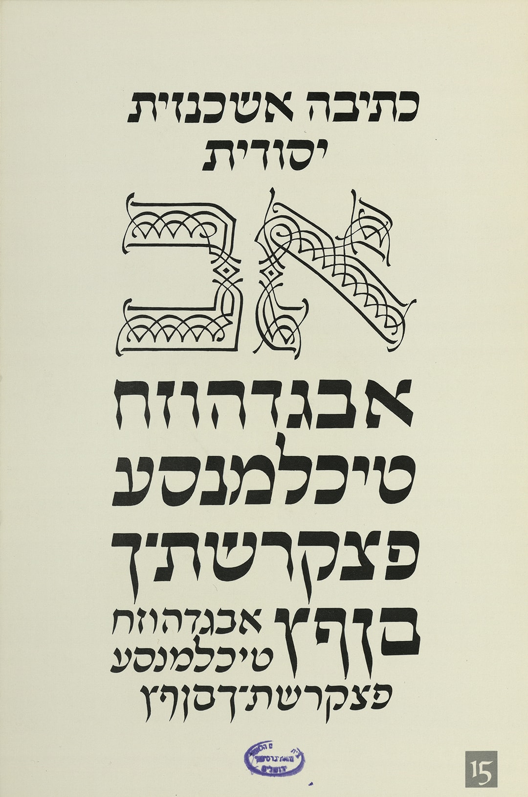
Plate 15: Basic Ashkenazic script
“Calligraphy is still a vital art form to some extent, […] but it is certainly one of the sources and stimuli that the graphic designer needs. […] If it is properly understood, it can offer great satisfaction to creators who wish to combine self expression with craftsmanship.” (personal translation from the book “The Work of Ismar David”)
The box set “The Hebrew Letter: Calligraphic Variations“, published by Itamar David with Jason Aronson in 1990, contains 32 different calligraphic type styles he designed, together with an instructional booklet. It is one of the finest examples of his work, and for us it is a rare opportunity to see the various alphabets he developed and reconstructed from Hebrew writings in ancient books and archaeological discoveries.
Itamar David
Itamar David (Ismar in Ashkenazic pronunciation, since the letter tav is not hard) is one of the most important type designers in the history of Israeli design. He was born in 1910 in the city of Breslau (then in Germany), and later studied at the Charlottenburg School of Applied Arts in Berlin. In 1932 he immigrated to “Palestine”, where he lived and worked in his studio for about twenty years. He worked on interior design and shop fronts, product design (furniture), and graphic design, and designed the typeface “David”. Like many designers of his generation, he had to work hard and often create something out of very little in order to build a Hebrew Israeli graphic, aesthetic and typographic culture.
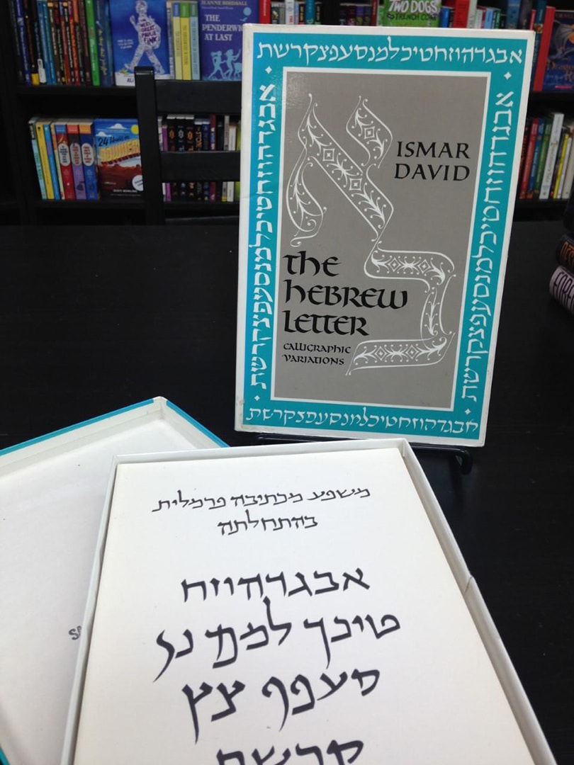
Photo of the box set: The Hebrew Letter. Source: AbeBooks
In 1953 he moved to New York to find more challenging work, and there he opened a studio that focused on interior design and decoration for synagogues, book cover design for leading publishers and Jewish religious institutions, and Judaica objects in his distinctive linear illustration style. At the same time, he taught, lectured and set up Hebrew and Latin typography workshops at Cooper Union, Pratt Institute and other well known institutions, gaining broad recognition and respect.
In 1979 David brought together all his ideas and knowledge about the history, aesthetics and technical aspects of the Latin letter into a substantial book titled “Our Calligraphic Heritage: The Geyer Studio Writing Book: Text, Charts and Compositions”, which includes Latin calligraphic alphabets and explanatory texts. His last ongoing project was the holiday greeting card that he sent every holiday for about six decades to friends and colleagues on three continents, before he passed away in 1996 in New York.
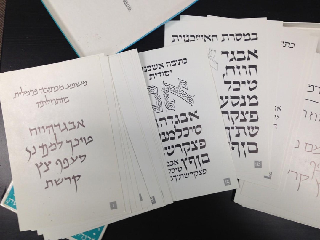
32 plates
For a long time David was aware of the need for a Hebrew calligraphic manual, and after students and friends wondered why he had still not created a Hebrew counterpart to his Latin guide, he published this set in 1990. The writing (calligraphy) booklet was created in the spirit of the European tradition of calligraphy copybooks. It contains short instructions and exercises for practicing Hebrew calligraphy, along with a short essay about the historical background of the Hebrew script and images of different writings from its history.
“The purpose of this book is to make students aware of an important principle: it is not enough simply to imitate the past. One has to know the past and the timeless elements in it, and make use of them.” (personal translation from the back of the box set)
For me, the most interesting part is the 32 printed samples on separate sheets. The samples seem to be arranged chronologically, in line with the essay in the booklet. They attempt to cover a broad history of Hebrew writing styles, beginning with ancient scripts discovered in archaeological excavations in the Land of Israel, which had a strong influence on David. The following plates present a range of styles from the cultures of Jews in Arab countries and Persia, through Sephardic script, to the writings of European Jewry.
A personal and distinctive style
David did not limit himself to documenting historical scripts, he also proposed his own calligraphic directions for the future development of Hebrew script. One of the most prominent new styles he created is called “Modern Writing”, which appears as a skeletal alphabet on plate 22, and again on plates 23, 24 and 32 in different weights and variations. The idea behind this style is to reduce Hebrew script to a rhythm of abstract forms built from triangles and a few rounded shapes, and it seems to have been influenced by the “Monumental Script” on plate 3, which echoes the carved letters of the Hasmonean period (150 BCE), the Herodian period, and up to the fourth century CE.
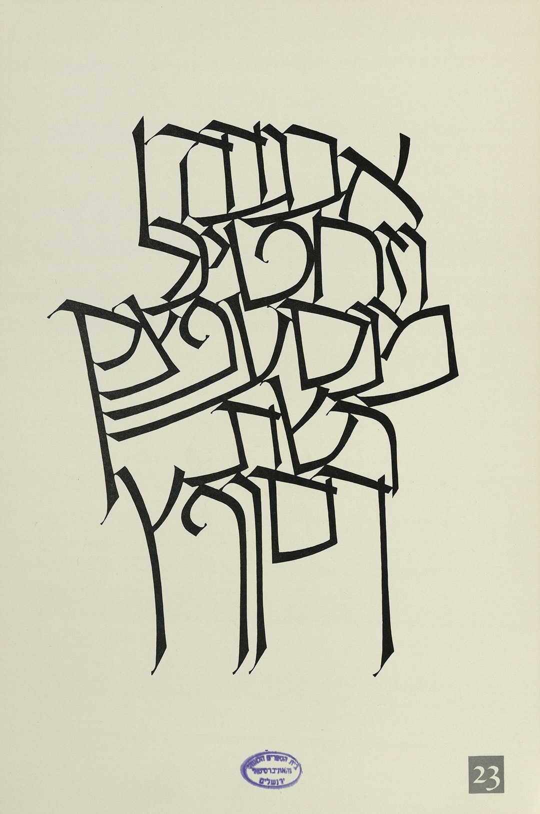
Plate 23: Variation on “Modern Writing”
“From the beginning, writing has been an attempt to turn speech into visual representation. In relation to the time and place in which it is created, the quality of this representation has always been a challenge, and it will continue to challenge the calligraphers of the future.” (personal translation from the book “The Work of Ismar David”)
The letters on plate 23 are drawn with varying, expanding stroke widths that are executed with virtuosity and give the letters an almost “regal” look that recalls Latin letters and also Gothic script (Fraktur). To paraphrase the Bible, the language may be different, yet “the hands are the hands of David”: the same distinctive formal language appears in some of his calligraphic works and Latin typefaces (it is highly recommended to get the book “The Work of Ismar David” to see this for yourself). His use of a long, slanted baseline and of thin, serif like connecting strokes between the roofs of the letters strengthens the feeling of rhythm or texture and creates a powerful typographic image.
For some reason, this set is considered a rare gem known only to a small circle of insiders. Perhaps the reason is that it was never sold in Israel, and today it is almost impossible to find copies of it. Did the fact that Ismar David lived in the United States make it harder for his ideas to spread in Israel? I hope that our readers will manage to find a copy and draw inspiration that will find its way into their future work, exactly as David intended.