The trend is an elusive phenomenon, hard to pinpoint and even harder to explain. We tend to ask who started it, who adopted it, and when it became “a thing,” but in reality trends take shape slowly, through an accumulation of small gestures, mutual influences, and the spirit of the time. Unlike other fields where trends смен quickly and disappear as suddenly as they arrive, in typography the process is slower and more complex. Letters absorb technology, culture, language, and reality, and change along with them.
Between the lines, you can also sense the spirit of the time, whether it’s a search for stability and clarity, or a pull toward fragmentation, movement, and uncertainty
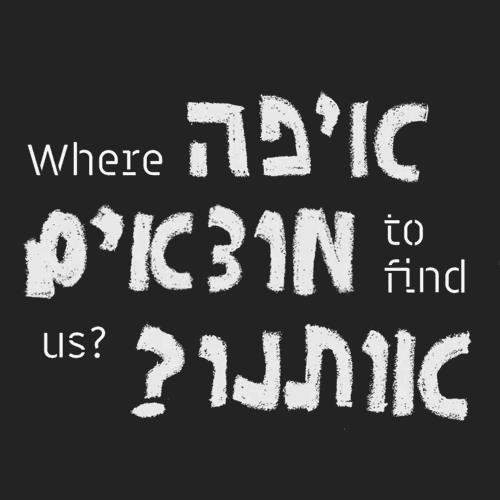
Since four years have passed since our last trend review, we set out to map the prominent currents in contemporary Hebrew typography. Some continue trends we’ve already seen, some sharpen, and some signal entirely new directions. Between the lines, you can also sense the spirit of the time, whether it’s a search for stability and clarity, or a pull toward fragmentation, movement, and uncertainty. As always, there are trends we’ll want to adopt, and others that may have already run their course. And there is one emerging direction at the end that hasn’t quite formed into a typographic trend yet, but it’s already clear it will significantly impact the design world.
We tried to give credit wherever we knew who was behind the design. If you recognize your work here without credit, we’d love to hear from you and update accordingly.
Blur
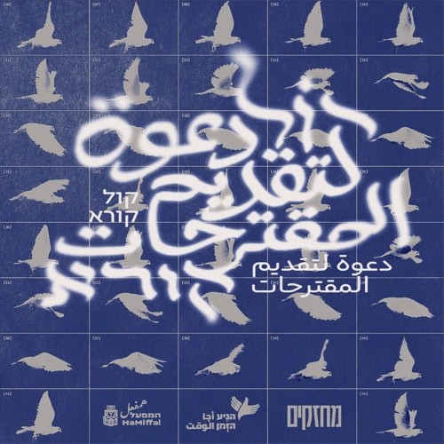
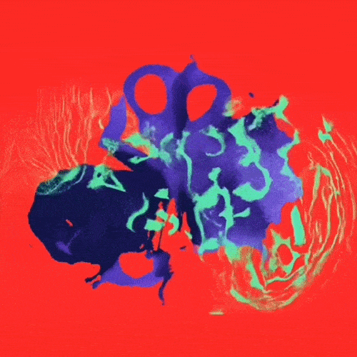
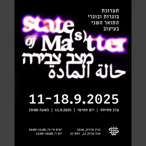
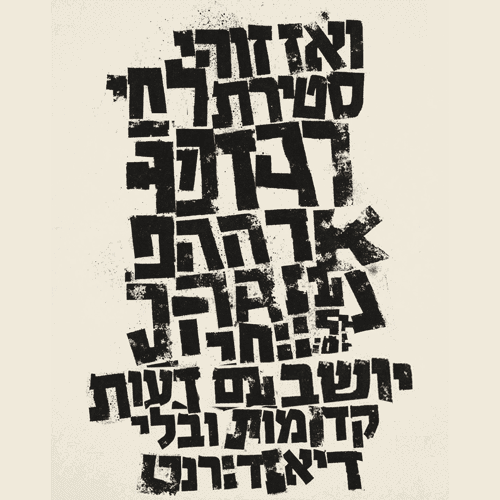
Where typography was once measured by sharpness, readability, and control of form, the blur trend seeks to challenge those values. Faded, thickening, dissolving, or melting letters appear more and more, especially in cultural, music, and exhibition design, but not only. Some say blur is not just an aesthetic effect, but a stance, expressing temporality, instability, and an ongoing process of masking and confusion. Sometimes it’s a digital image, sometimes a simulation of physical material, smeared ink or worn print. In a world saturated with sharp, algorithmic messages, blurred typography creates a space of uncertainty and invites the viewer to come closer, complete, and interpret.
-

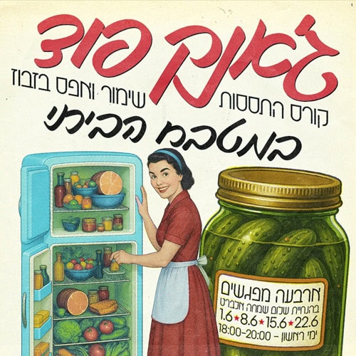
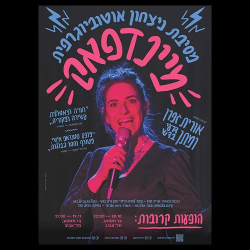
- רוני מוסקו
-
- אמבר חלגואה
-
- סטודיו רוני ורוני
-
- איתמר בוחניק
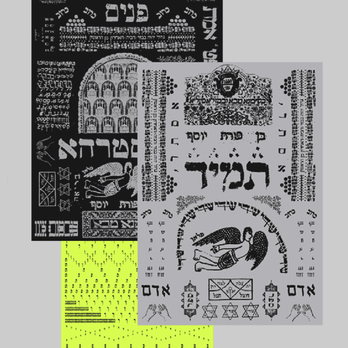
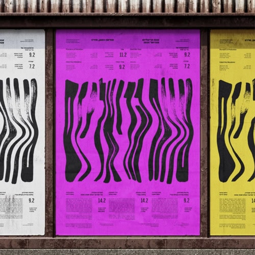
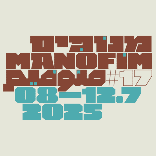
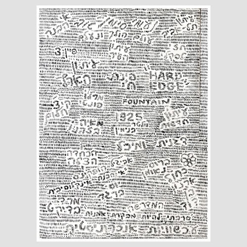
Dots and Particles
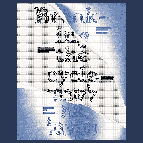
One of the most prominent trends we’ve been seeing in recent years is letters constructed from dots. Sometimes the dots form a complete letter, and sometimes they only hint at it, leaving the mind to complete the shape. The trend raises questions about resolution, deconstruction, and reconstruction in an increasingly digital world. The dotted structure builds the complete form of the letter and creates rhythm and order. Like blur, readability here is not immediate, but emerges from distance and often requires effort from the viewer.
-
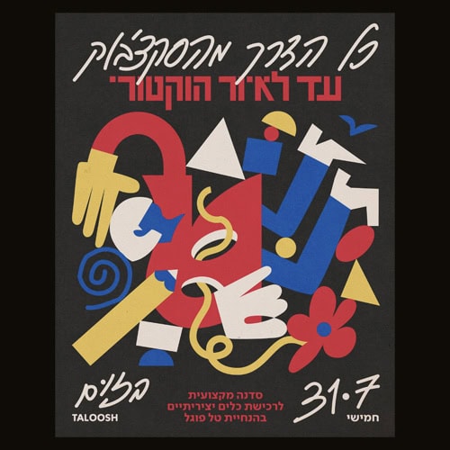
- Designit Tel Aviv
-
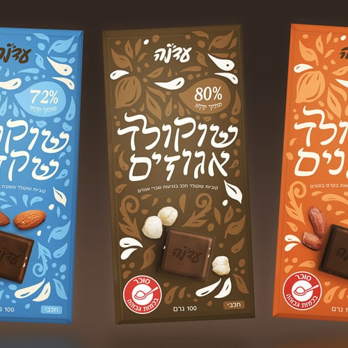
- אשגר זמנה
-
- [קרדיט לא ידוע]
-
- רה־לבנט
Font Blending
Instead of choosing a single font, more and more designers are combining two or more, in ways that merge and almost dissolve into one another. A letter that starts in one style and ends in another, gradual transitions between weights, or hybrid combinations that create a new skeleton from multiple sources. The result is typography in motion, unstable in its identity, challenging the clear boundaries between fonts. This trend reflects a desire to break hierarchies and propose a layered, complex identity that doesn’t align with a single defined style but exists precisely in the space between.
-
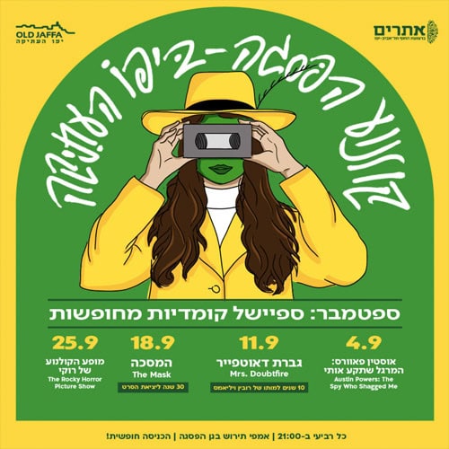
- גל שינרמן
-
- נעמה נמר
-
- עומרי אברהם
-
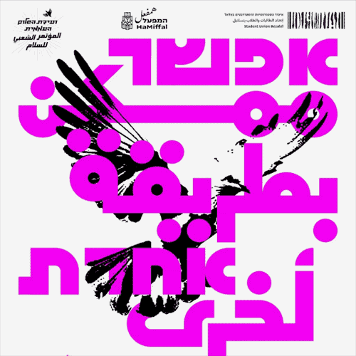
- נטע זינו
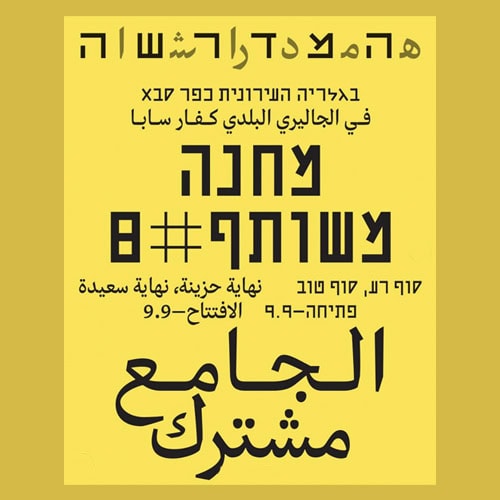
Thin Letters
Thin letterforms return to headlines, bringing quiet elegance and restrained minimalism. Extremely fine strokes, sometimes on the verge of disappearing, convey precision, sensitivity, and control, offering an alternative to the heavy, loud aesthetics of recent years. The fragility of thin letters, dependent on resolution, contrast, and spacing, becomes a conscious choice that signals confidence and a willingness to leave room to breathe.
-
- סטודיו עמל
-
- סטודיו עמל
-
- סטס טוצ׳ינסקי
-
- [קרדיט לא ידוע]
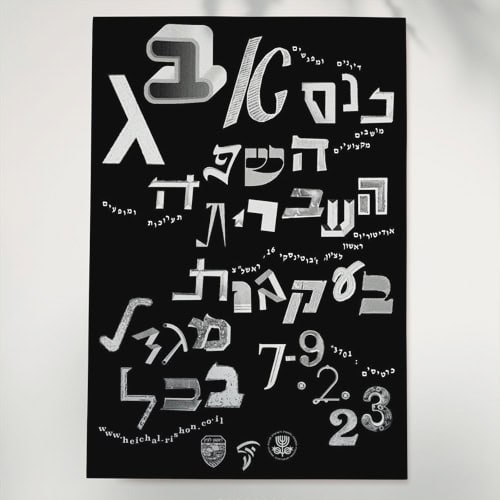
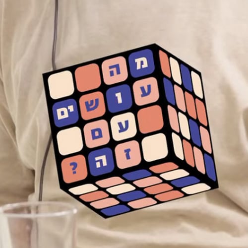
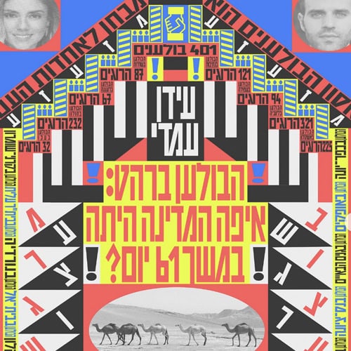
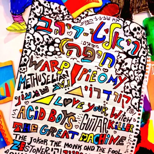
Type Salad
Scattered letters, each in a different font, combining styles, weights, sizes, and colors within the same word or headline. The type salad trend celebrates inconsistency and abandons the idea of a unified typographic voice in favor of a playful, collage-like composition that emphasizes individuality and character. When done with sensitivity and skill, the result is a precise mess, one that almost makes you want to take the design and eat it for dessert.
-
- עדן לנק
-
- אליה־ים
-
- דן עוזרי ויואב פרי
-
- [קרדיט לא ידוע]
Monospace
Monospace typefaces, where each character occupies the same width, are making their way from code and computing into the forefront of design, with a clear nod to typewriters. On one hand there is cold, logical precision, and on the other a memory of ink, irregularity, and mechanical noise. The tension between new and old, digital and analog, is what gives this trend its character. In cultural, tech, and contemporary branding, monospace creates rhythm and structure, but also a nostalgic softness that tempers its rigidity.
-
- רה־לבנט
-
- גילס
-
- [קרדיט לא ידוע]
-
- רה־לבנט
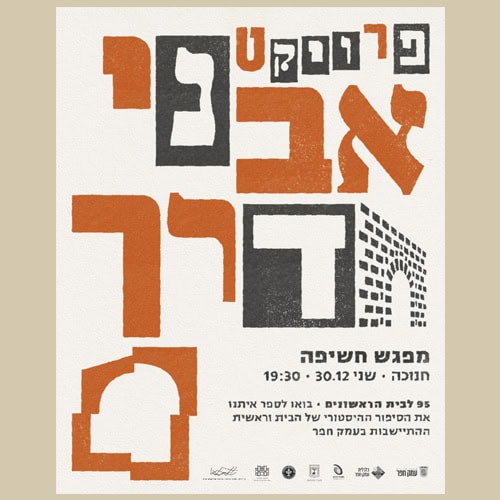
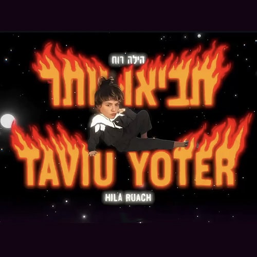
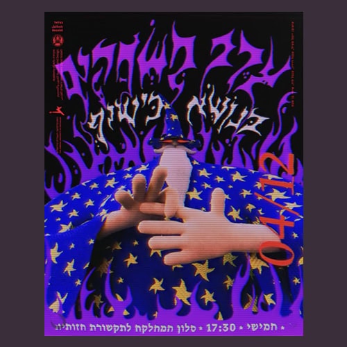
Grunge Serif
If serif type has returned in recent years polished and tailored, grunge serif seeks to dirty it again. Letters with broken serifs, rough edges, and textures that mimic old print or material wear charge classical elegance with contemporary tension. In cultural, fashion, and even culinary design, this combination connects tradition with intentional imperfection and roughness. The result feels slightly underground, telling a story of dialogue between order and disorder, classic and rebellion.
-
- ענת גוטברג
-
- גיא שגיא
-
- נעמי גייגר
-
- רותם כהן־סואיה
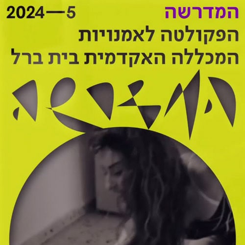
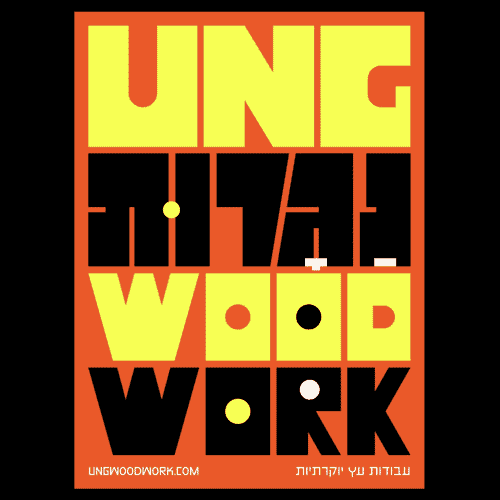
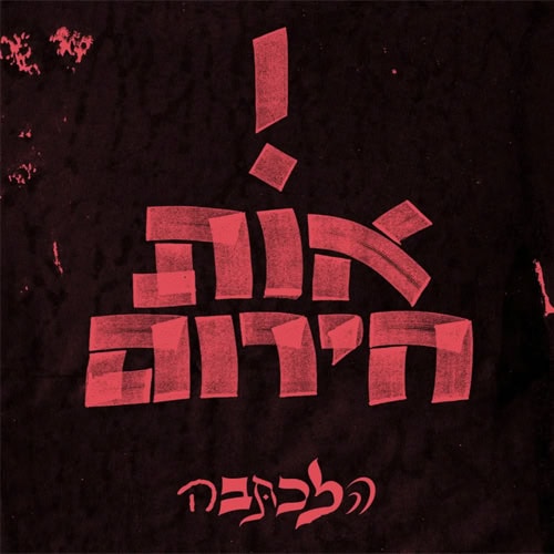
Intentional Awkwardness
Typography composed of basic, disproportionate, almost awkward letterforms built only from straight lines creates a language that declares itself unapologetically. There’s no attempt to polish or adhere to aesthetic rules, on the contrary, there is a conscious choice of crude simplicity, sharp angles, and forms that look “wrong.” This deliberate strangeness, executed with confidence, gives the letters a strong and distinctive presence.
-
- שמואל אפטר
-
- [קרדיט לא ידוע]
-
- [קרדיט לא ידוע]
-
- סטודיו ETC
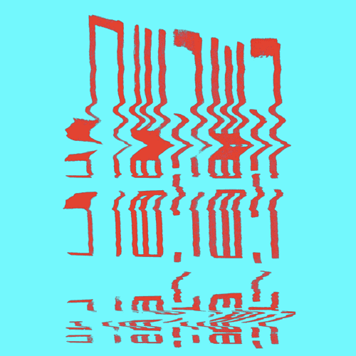
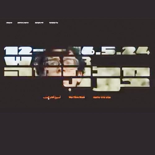
Scan Smears
Letters that smear, distort, or drag as if through a faulty scanner or a flawed printing process become a typographic language of their own. Sometimes digital, sometimes physical, repeated scanning, motion during capture, or simulated glitches, the result is similar: a letter that loses stability and gains movement. This trend sits on the edge between loss of control and calculated aesthetics, creating urgency, noise, and materiality, as if the message itself is being distorted mid-transmission.
-
- נעמה נמר
-
- נעה שלום
-
- רותם כהן־סואיה
-
- אלכס ווז
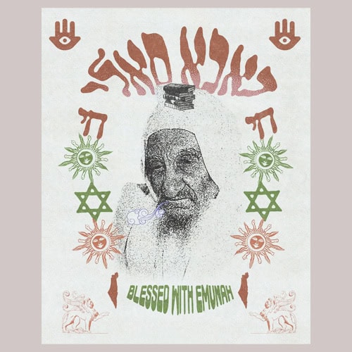
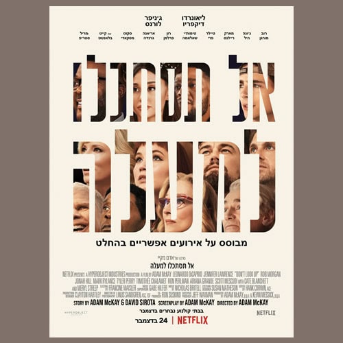
Image Inside Text
The use of clipping masks, where images or textures are embedded בתוך letterforms, continues to gain presence, sometimes combined with animation. Beyond the visual effect, there’s also a contextual logic: in a noisy, open world, the image moves inward and is confined within clear boundaries, creating a sense of containment and control.
-
- שני בוגנים
-
- [קרדיט לא ידוע]

-
- [קרדיט לא ידוע]
-
- [קרדיט לא ידוע]
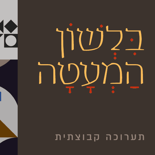
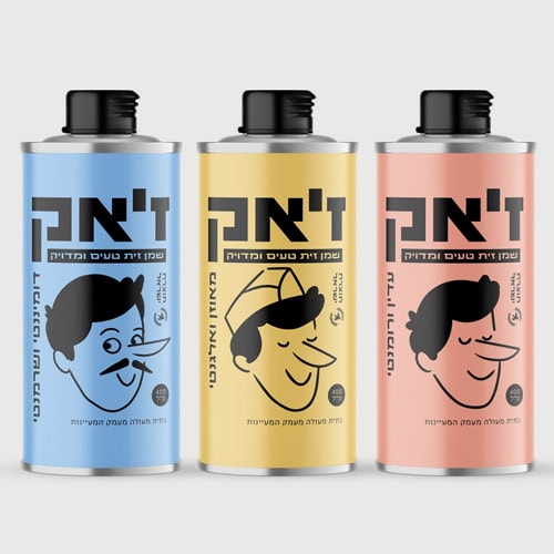
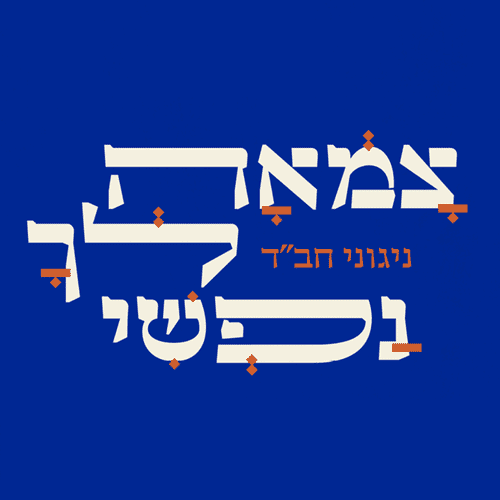
Emphasized Diacritics
Diacritics, usually a functional addition, become a central design element. Dots, squares, lines, and marks gain unusual scale, weight, and placement, sometimes sitting on top of the letter, creating rhythm, imagery, and meaning. This trend plays with the boundaries of language, between readability and interpretation, adding another expressive layer to the text.
-
- עומר רביבי

-
- ערן בן ברק ורותם כהן־סואיה
-
- בנציון גולדמן
-
- גרוטסקה
Soft Sans
Sans-serif letters with soft, rounded edges bring a sense of warmth and accessibility, especially in tense times. Instead of sharp cuts, the corners soften and the structure rounds out, creating a more human, embracing, less formal feel. Beyond aesthetics, this is also an emotional choice, typography that aims to soothe, invite, and speak at eye level.
-
- רה־לבנט
-
- סטס טוצ׳ינסקי
-
- טבע שולט
-
- ליאורה שירר
Animation
The letter leaves stillness and gains time, movement, and behavior. Thanks to technological advancements, animated typography becomes a central tool on screens. From subtle motions to complex sequences, kinetic type, effects, and 3D bring text to life, sometimes with sound. Movement is not just decoration but part of meaning, highlighting, breaking apart, connecting, and guiding attention.
-
- נעה שלום
-
- [קרדיט לא ידוע]
-
- [קרדיט לא ידוע]
-
- סטודיו עמל
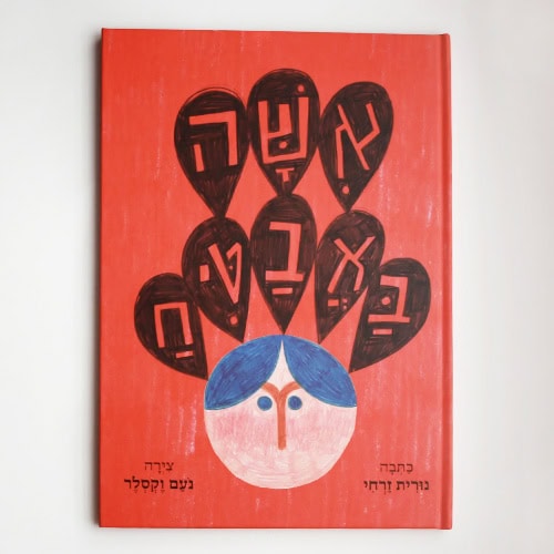
Scribbled Letters
Letters that look like quick notebook scribbles, unstable lines, markers, pens, and pencils become a conscious typographic language. As part of the revival of hand-made typography, more creators design letters as an integral part of the visual, often through loose, spontaneous drawing that emphasizes process over perfection. In this sense, it is also a clear reaction to the digital and AI-driven era, an attempt to bring back touch, error, and humanity. What was once considered a sketch becomes a statement.
-
- איל זקין
-
- נעם וקסלר
-
- אנטולי צ׳ונין
-
- מאור פרידמן
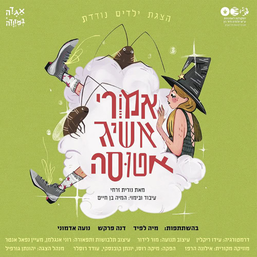
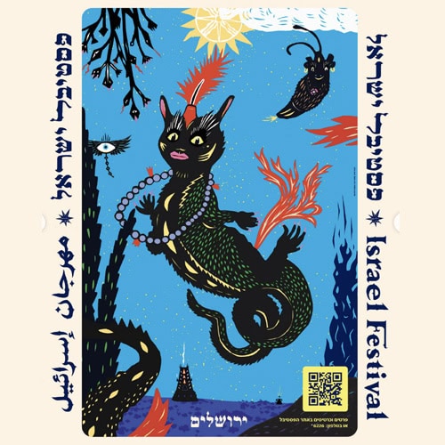
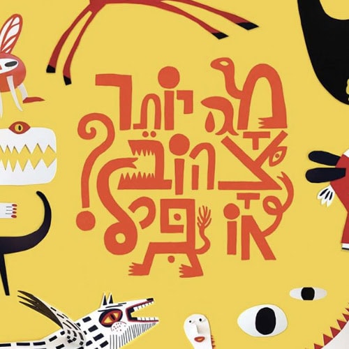
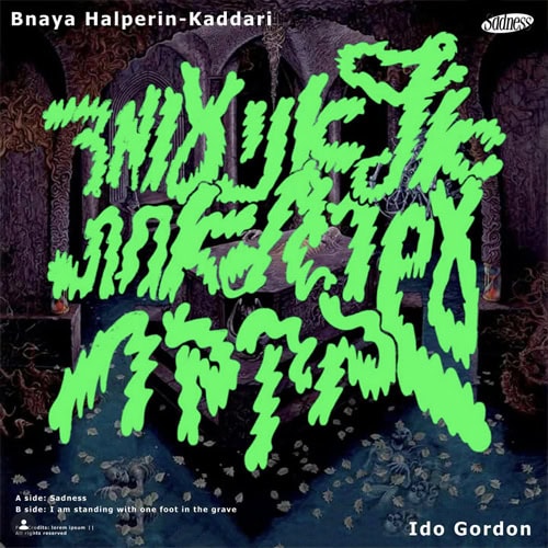
Illustrated Letters
The letter becomes a character, a creature with personality, expression, and story. Illustrated letters stretch, distort, and gain details that give them life. Skilled illustrators can take this far, but in the age of AI, the boundaries blur, and it’s sometimes hard to tell what is handmade and what is generated. Still, for it to truly work, talent, understanding, and precise decisions are essential.
-
- ענת ורשבסקי
-
- עידו גורדון
-
- [קרדיט לא ידוע]
-
- יובל מציל, ענבל רוזין, ענבל לוז ואיתי בן־שבת
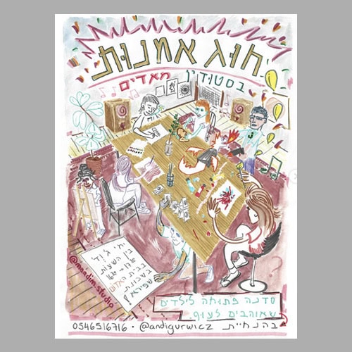
Sketchbook
The aesthetic of sketchbooks and zines seeps into design, bringing a sense of in-betweenness, something intentionally unfinished. Letters that look like quick drawings, handwriting, cut-and-paste, imperfect layers, and deliberately “cheap” print create a personal, rough, intimate language. It distances itself from digital perfection and carries nostalgia, longing for pencil scribbles, paper, ink, and material.
-
- דברים בעולם
-
- סטודיו מאדים
-
- אוהד חדד
-
- [קרדיט לא ידוע]
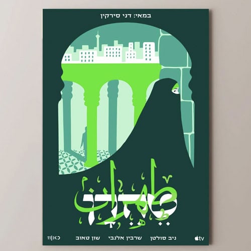
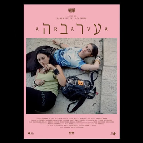
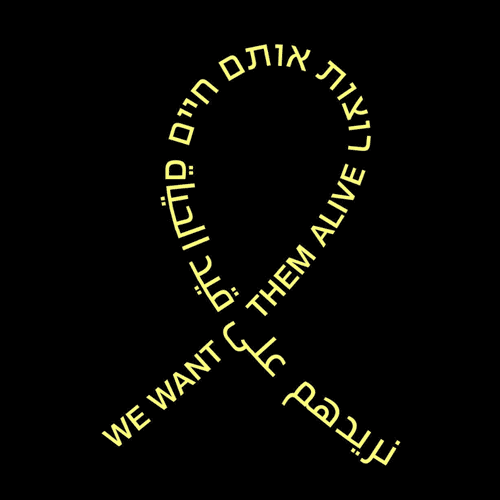
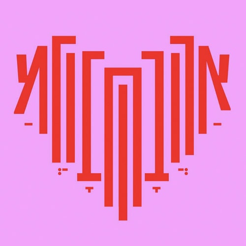
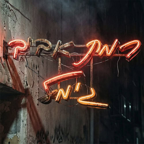
Wandering Letters
Text breaks free from the straight line, letters move along paths, curves, and free shapes across the page. These wandering letters create dynamic, expressive compositions that guide the eye and become a design element in themselves.
-
- [קרדיט לא ידוע]
-
- [קרדיט לא ידוע]
-
- [קרדיט לא ידוע]
-
- עודד בן־יהודה
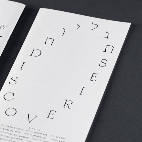
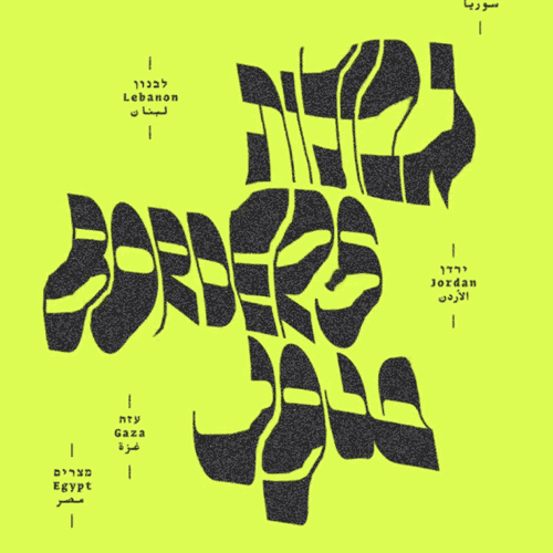
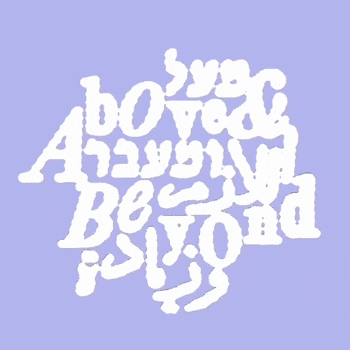
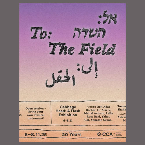
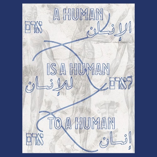
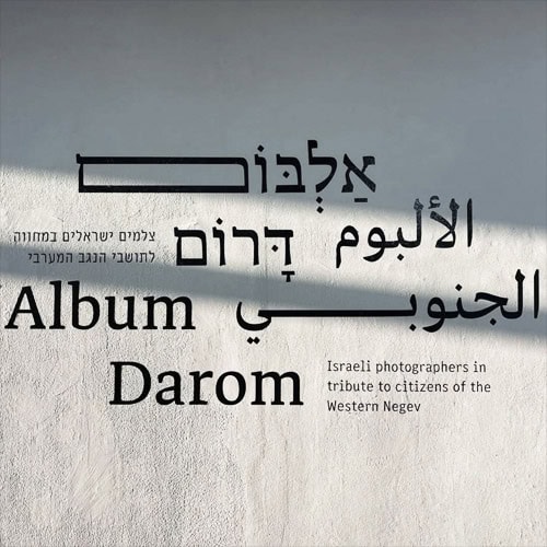
Multilingual Homogeneous
Designing lettering across multiple languages in a unified typographic style becomes a challenge. It is not simple to design Hebrew, Latin, and sometimes Arabic, Russian, and more, so they feel like part of one family, sharing proportions, weights, and rhythm. In a global, multicultural world, this trend expresses a desire for harmony and smooth communication.
-
- שני־גל בוגנים
-
- עדן בנג׳י־הנדלר
-
- איתם טובול
-
- [קרדיט לא ידוע]
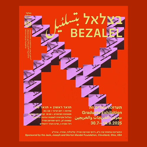
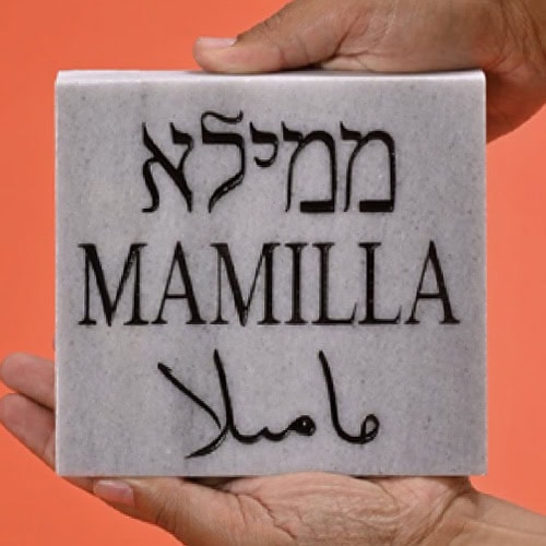
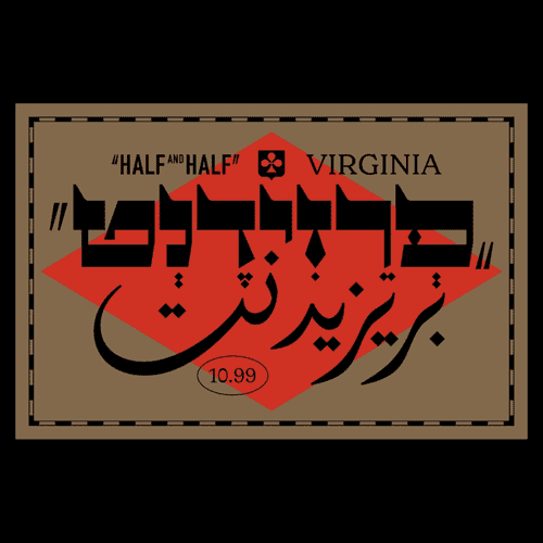
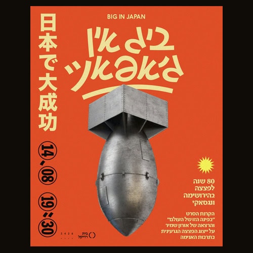
Multilingual Eclectic
More and more designs choose not to unify languages under one style, but to highlight differences and celebrate the richness of each writing system. Hebrew, Latin, and sometimes Arabic appear together while maintaining distinct character. The tension creates a lively composition that embraces gaps rather than hiding them.
-
- [קרדיט לא ידוע]
-
- נעה ישראלי
-
- רותם כהן־סואיה
-
- שביט יעקב־גור
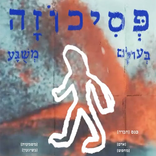
Contemporary Cursive
The letter begins to flow again. Not necessarily traditional handwriting, but a contemporary interpretation with slanted lines, calligraphic gestures, and subtle movement within a modern structure. It softens geometric rigidity and brings back a sense of humanity and spontaneity.
-
- [קרדיט לא ידוע]
-
- עומר בית־הלחמי
-
- טל פוגל
-
- [קרדיט לא ידוע]
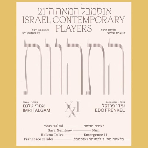
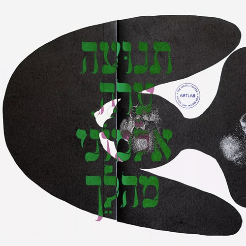
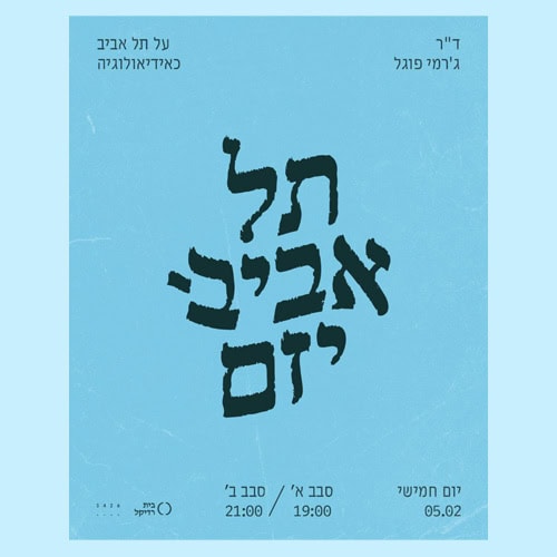
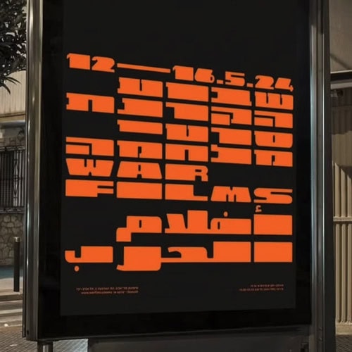
Letter Stretching
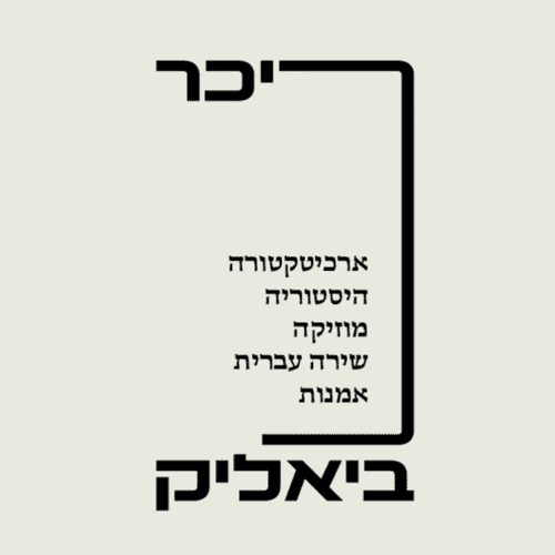
This trend is especially unique to Hebrew letterforms, letters extend beyond their natural proportions, often horizontally, sometimes vertically, sometimes to the edge of readability. Stretching creates drama and rhythm, turning words into memorable shapes.
-
- [קרדיט לא ידוע]
-
- רה־לבנט
-
- הילה פיש
-
- שגיא כרמי
Digital Brush
Digital brushes that simulate handwriting become central tools for expressive typography. Instead of pen and paper, designers use tablets and styluses, creating work that sits between analog and digital, controlled and spontaneous.
-
- מיכל מגן
-
- מאיה גור
-
- שפרה פליסקין
-
- דוב אברמסון
Hybrid Print-Cursive
What was once considered less legitimate, mixing print and cursive letters within the same word or sentence, has become common. The combination creates a hybrid language that balances order and freedom.
-
- איתמר בוחניק
-
- מינוס ספרים
-
- [קרדיט לא ידוע]
-
- [קרדיט לא ידוע]
Artificial Intelligence
And one for next year: AI has already entered typography, bringing experiments and aesthetics generated from prompts. It’s easy to be impressed, but it still lacks deep understanding of language and structure. For now, it sharpens the distinction between gimmick and craft, placing the designer as editor and director rather than replaced creator. It’s a powerful tool, and it will be interesting to see where it leads.
-
- ירונימוס
-
- אדוארדו מיטלמן
-
- חן מכבי
-
- [קרדיט לא ידוע]
In Conclusion
Ultimately, typographic trends are not just about style, but a reflection of the time and reality in which they are created. They reflect our relationship to technology, material, language, and identity, and are shaped by cultural and economic conditions. Some will stay, others will fade, but together they tell a broader story about where Hebrew design stands today.